
 Enfineitz
Inflight Recurrent Training Modernization
Transforming a high‑risk, paper‑based compliance process into a streamlined, error‑resistant digital experience for flight attendant drill instructors.
Project overview
Alaska Airlines requires every flight attendant to complete annual recurrent training, and in some cases, requalification. These drills happen daily across multiple bases, and the stakes are high: a mis‑scored drill can lead to union grievances, costly penalties, or even FAA compliance violations. A flight attendant incorrectly marked as failing might miss work and file a grievance; one incorrectly marked as passing could pose a safety risk.
The entire process was paper‑based. Drill instructors filled out forms by hand, audited each other’s work, and shipped packets of scores to administrators. Errors were common, delays were inevitable, and the system depended on redundant data entry into multiple databases. Lost packets, mis‑scored drills, and inconsistent record‑keeping were routine.
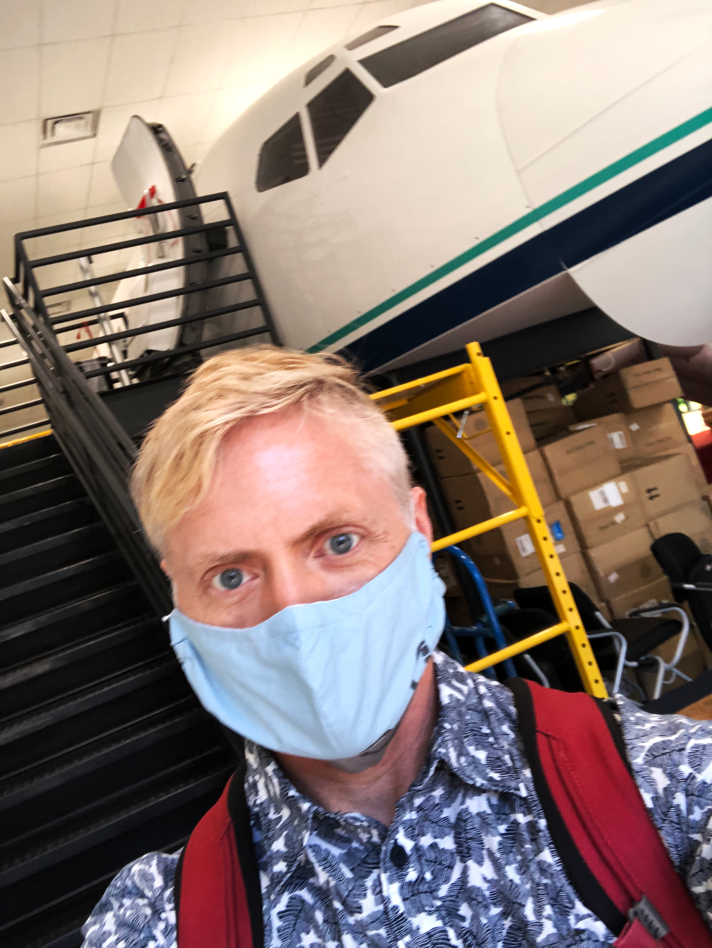
I took on this project as a Lead UX Designer, which later extended my contract another 30 days because of the project’s urgency. Leadership framed the problem as a digitization effort, but during my field study inside a 737 training cabin, I realized it was much more: this was a human‑factors problem, a workflow problem, and a cognitive‑load problem.
The solution needed to eliminate errors, reduce stress for drill instructors, and ensure compliance — all while being intuitive enough for non‑technical users working under time pressure.
Exploration and discovery
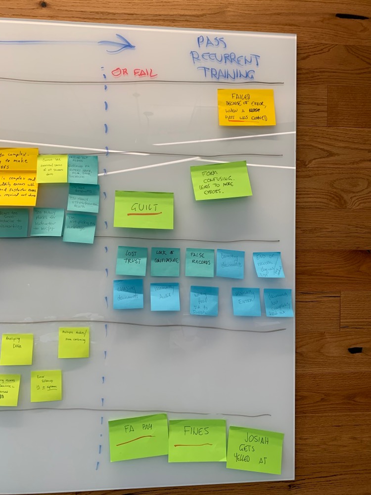
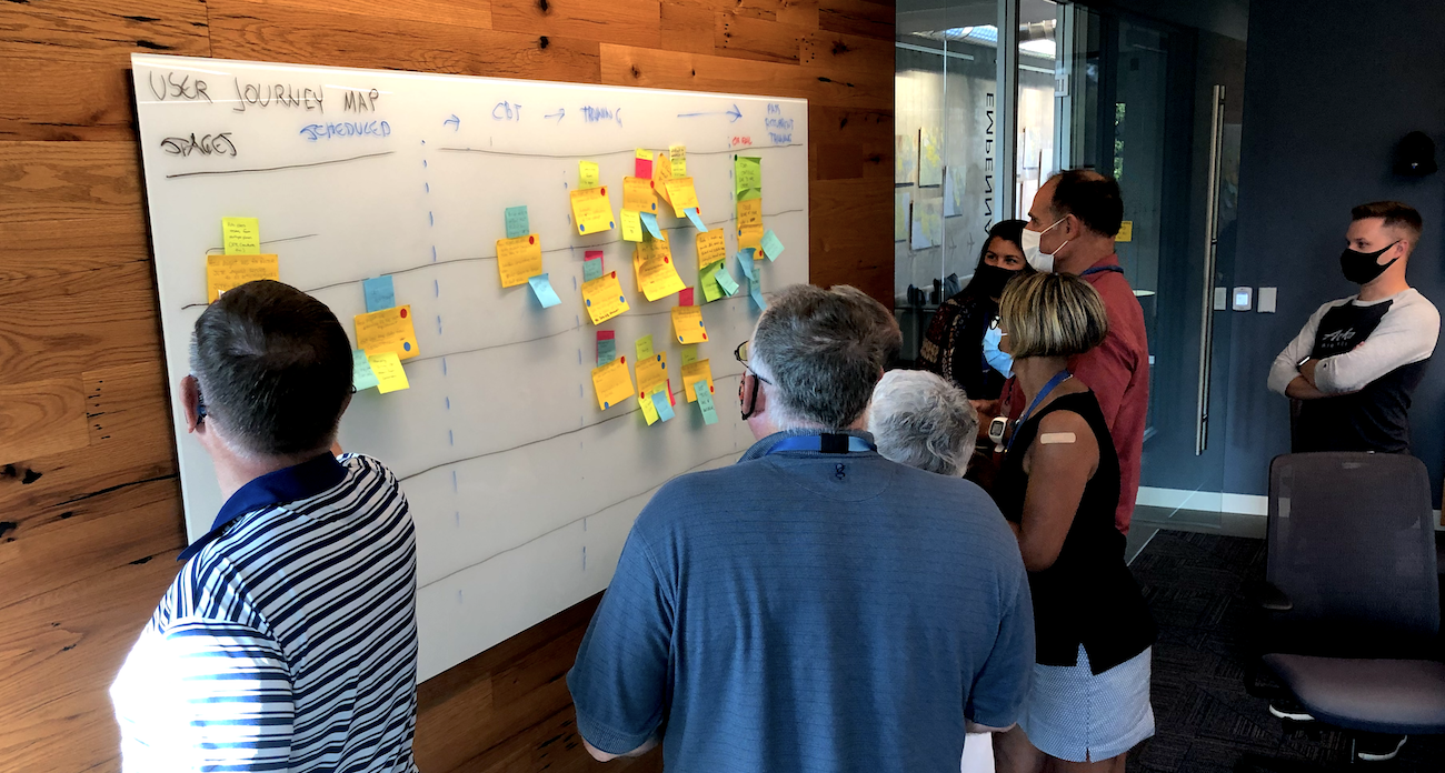
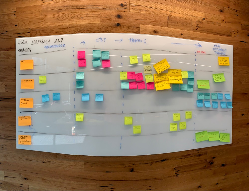
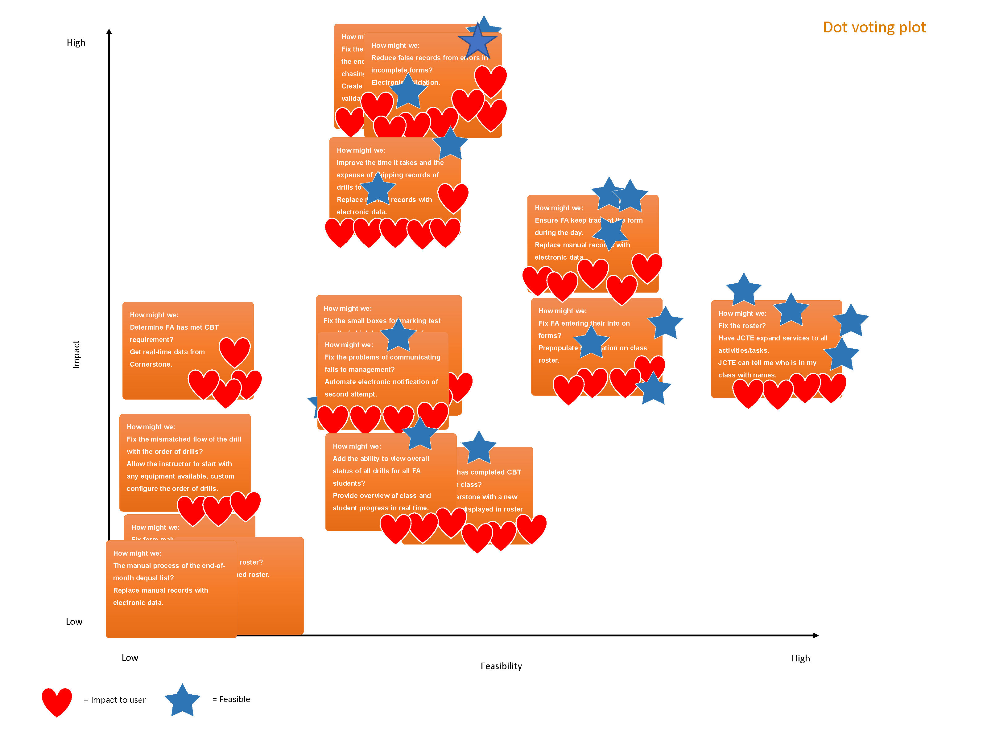
My discovery work began with interviews with the manager of the flight attendant training program. This helped me define the problem space, map the user journeys, and form hypotheses about where errors originated. From there, I shadowed drill instructors during live training sessions, observed how they tracked progress, and facilitated a workshop with instructors and product team members to prioritize pain points.
The most surprising insight was how normalized errors had become. Drill instructors expected mistakes — so much so that they built peer auditing into their workflow. They didn’t trust the paper system, and they compensated with extra steps that cost time and still failed to catch everything.
Emotionally, instructors were under constant pressure. They had to expect a few no-shows, and a missed session would be costly for the airline. They were responsible for ensuring every drill was completed correctly, but their methods were prone to errors.
The biggest gap between the intended and actual process was visibility. Instructors couldn’t easily see which drills each flight attendant had completed, who was partially done, or who needed remediation. In a room full of trainees, they were essentially guessing.
These insights shaped the foundation of the solution: the system needed to reduce cognitive load, provide real‑time clarity, and eliminate opportunities for human error.
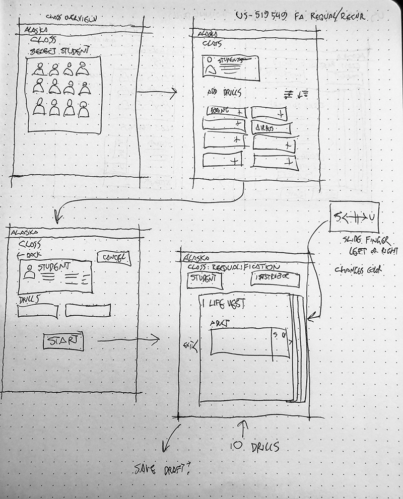
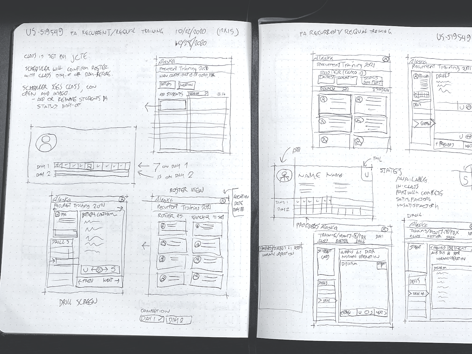
UX design process
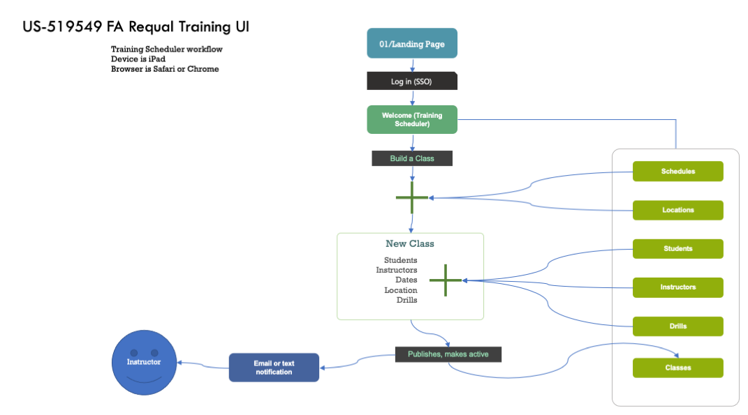
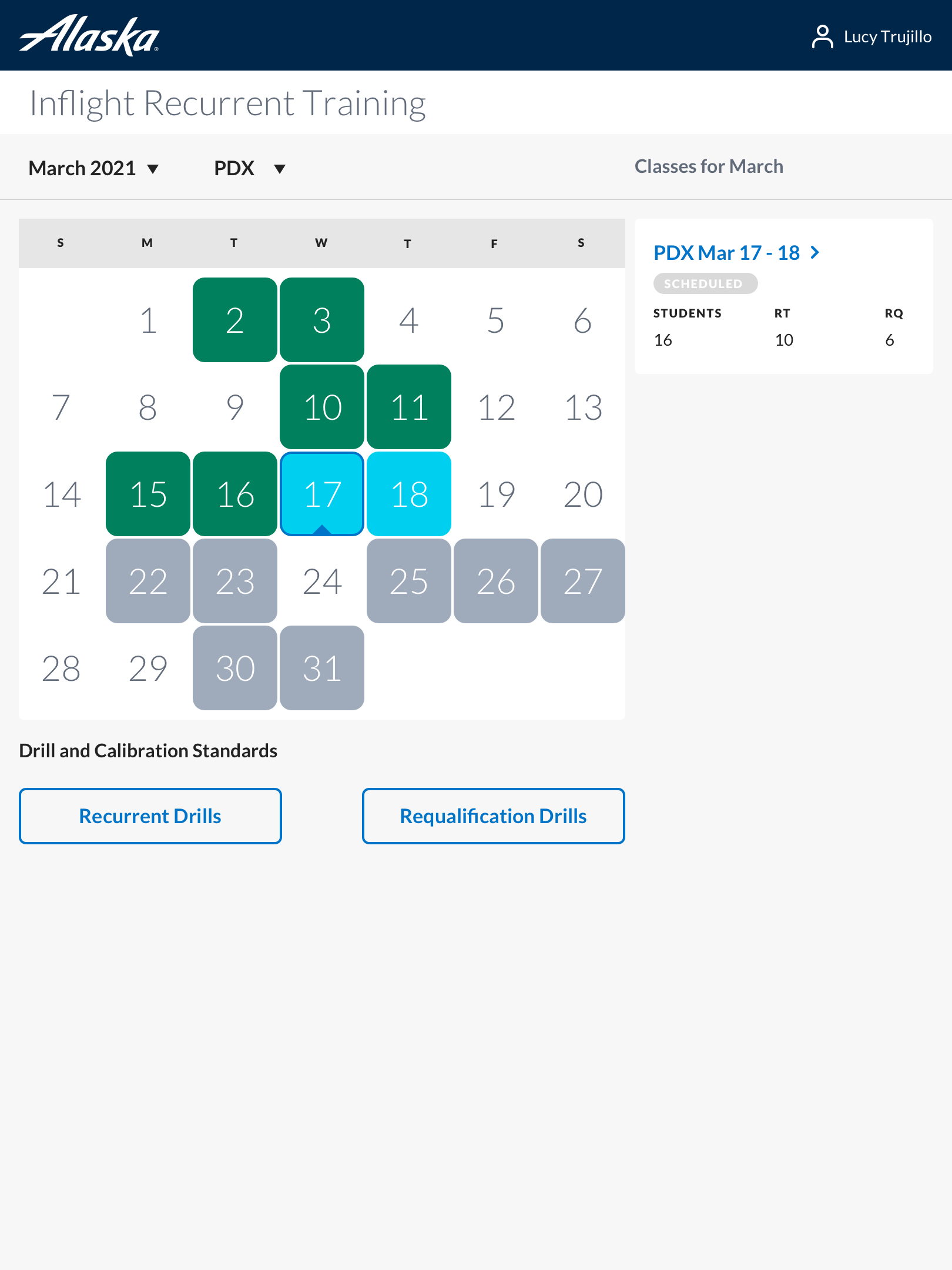
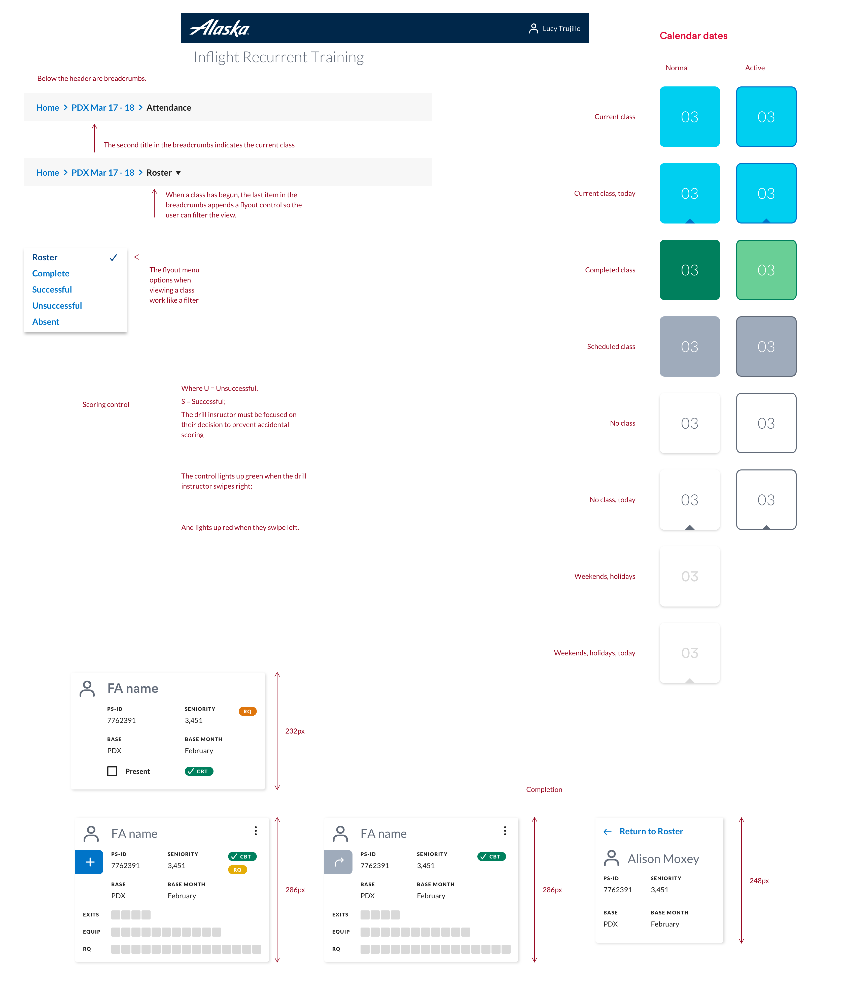
I designed the entire experience from 0→1. While individual drill screens were straightforward, the scheduling and class‑management workflows were complex. I needed to design a calendar system that could show classes across multiple bases — Seattle, Portland, San Diego, and more — and distinguish between current, upcoming, and completed sessions. Off‑the‑shelf components weren’t flexible enough, so I designed a custom calendar with filtering, color‑coding, and iconography to reduce cognitive load.
I created a few new UI patterns specifically for this tool:
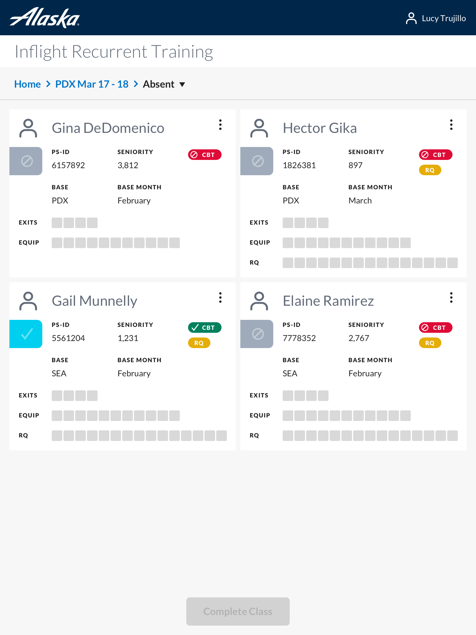
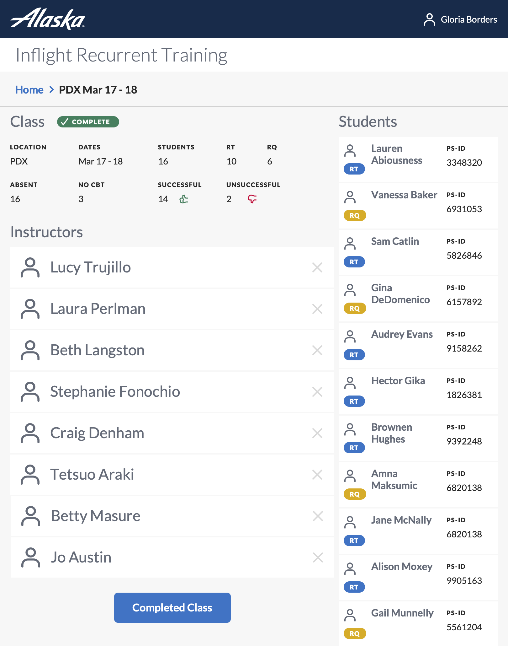
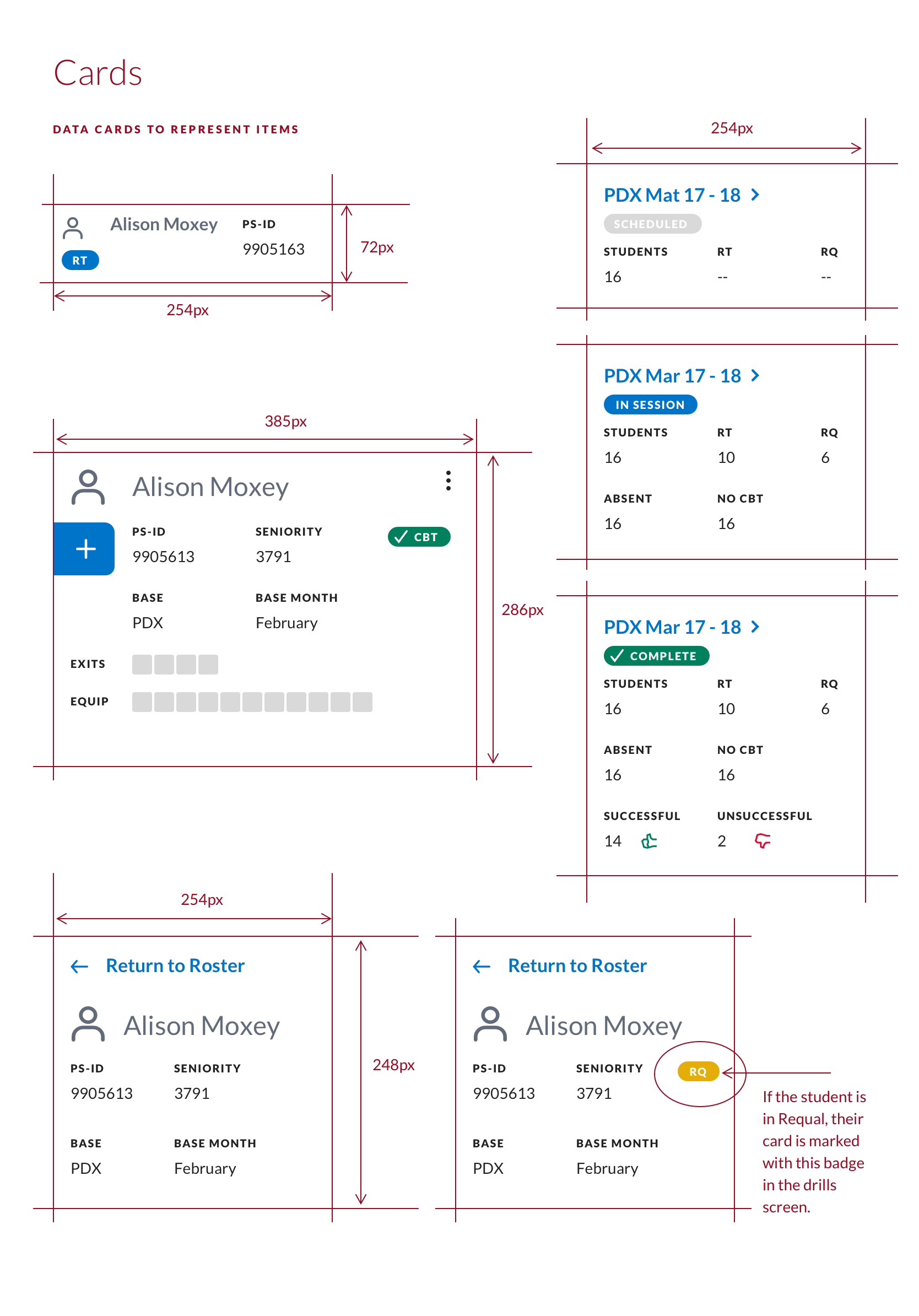
A card system for each flight attendant, using color and iconography to communicate status without relying on text.
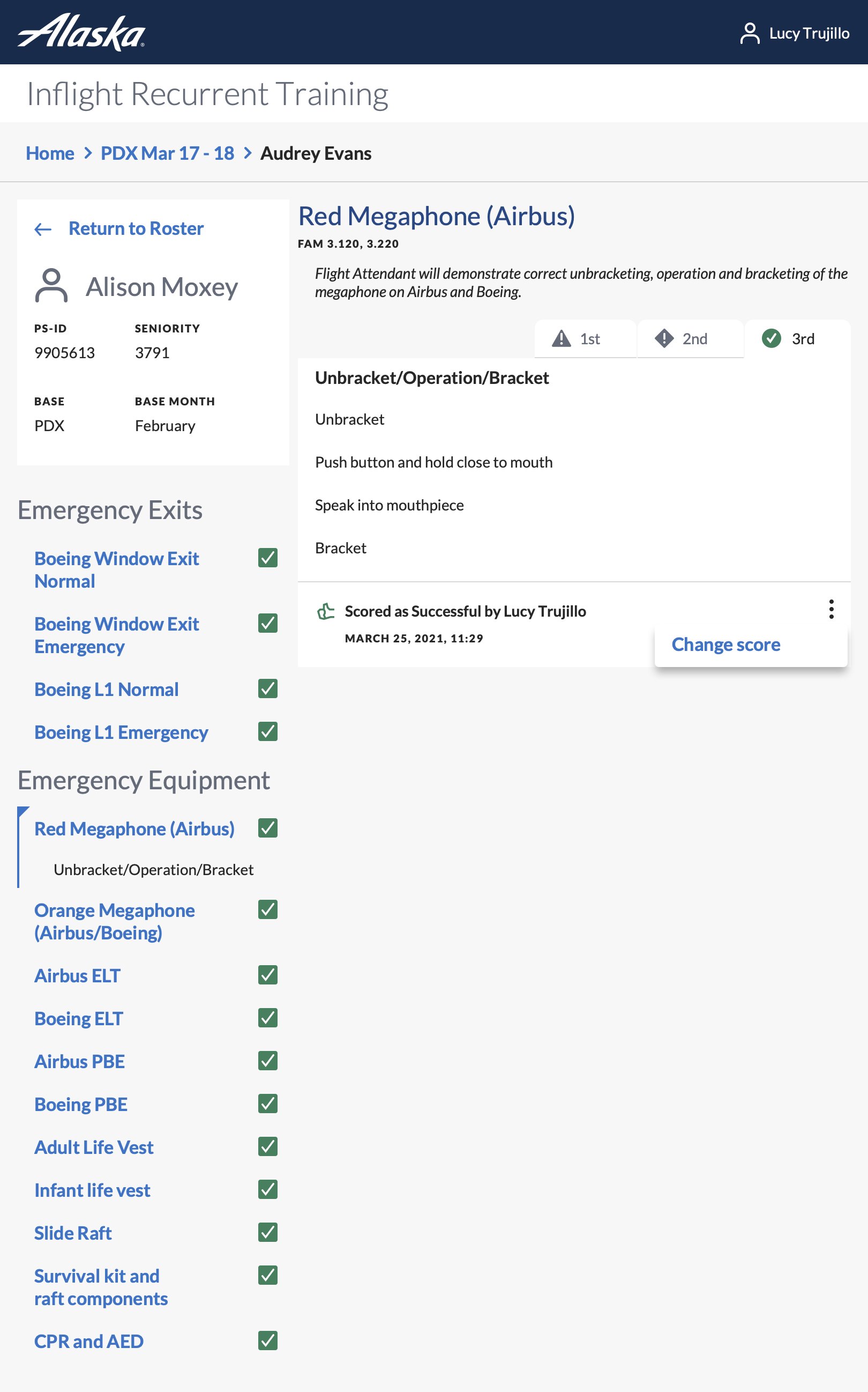
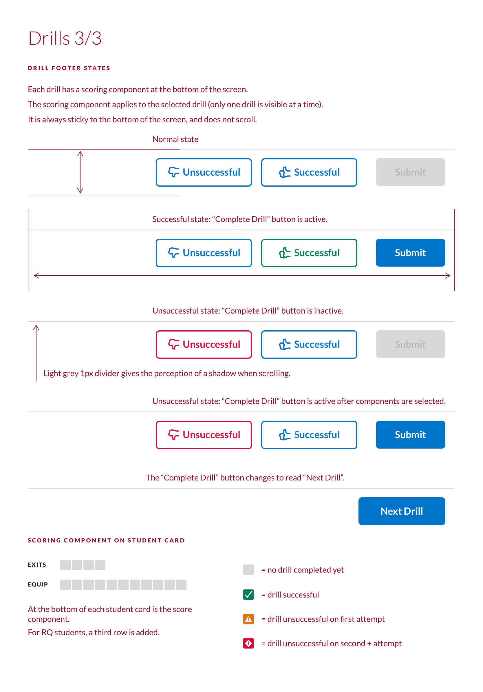
A pass/fail component with clear visual affordances.
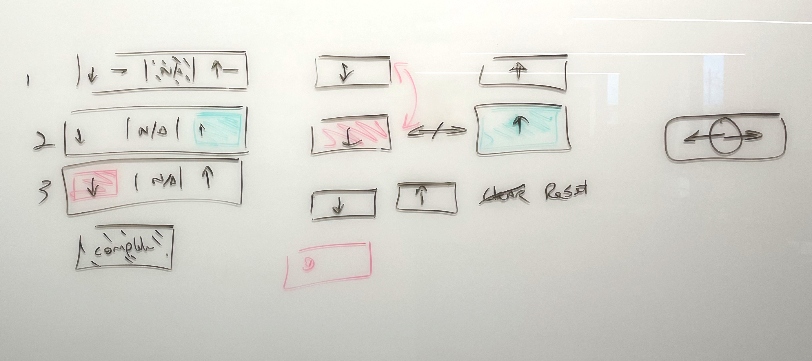
A drill‑progress component that allowed drills to be completed in any order — a major improvement over the rigid paper workflow.
A simplified auditing workflow that reduced edge cases and made verification intuitive.
Designing for iPads inside aircraft cabins posed fewer challenges than expected. Flight attendants were already accustomed to using iPads and iPhones in their daily work, so the device fit naturally into their mental model.
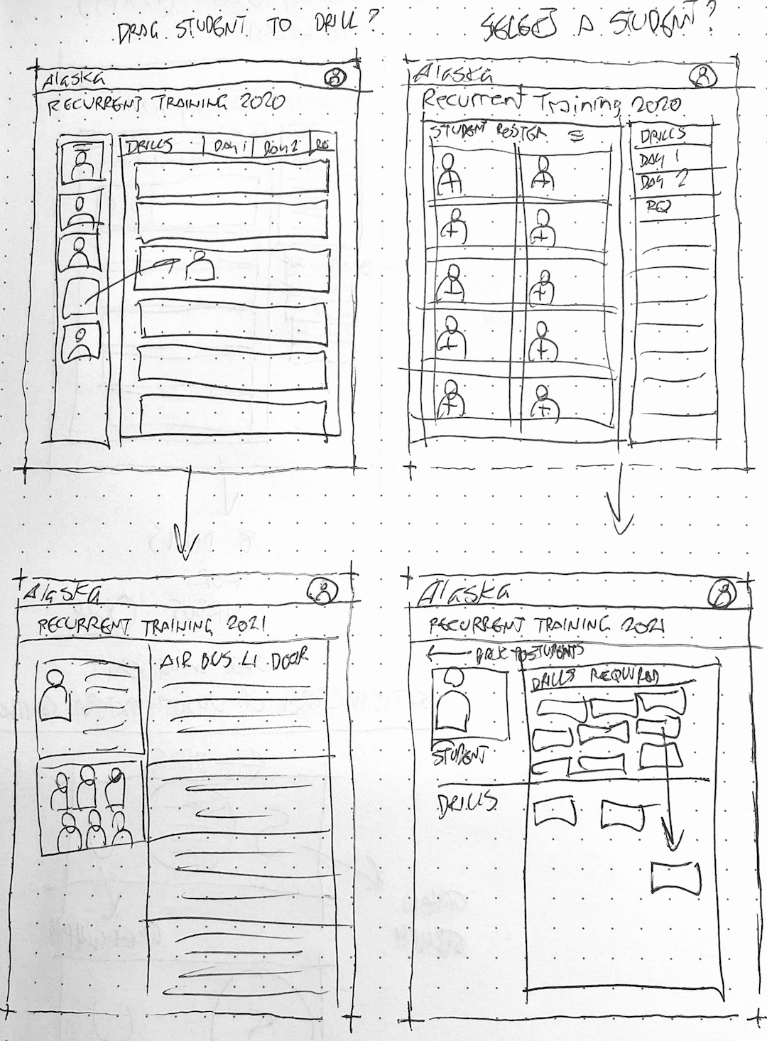
I validated my design decisions through iterative reviews with the Principal UX Designer, the PM, and the director of flight attendant training. I created interactive prototypes, tested assumptions early, and refined the flows based on feedback. One design tradeoff I had to let go of was a drag‑and‑drop workflow for assigning drills — a concept I believed would reduce friction, but stakeholders preferred a simpler approach.
Final design
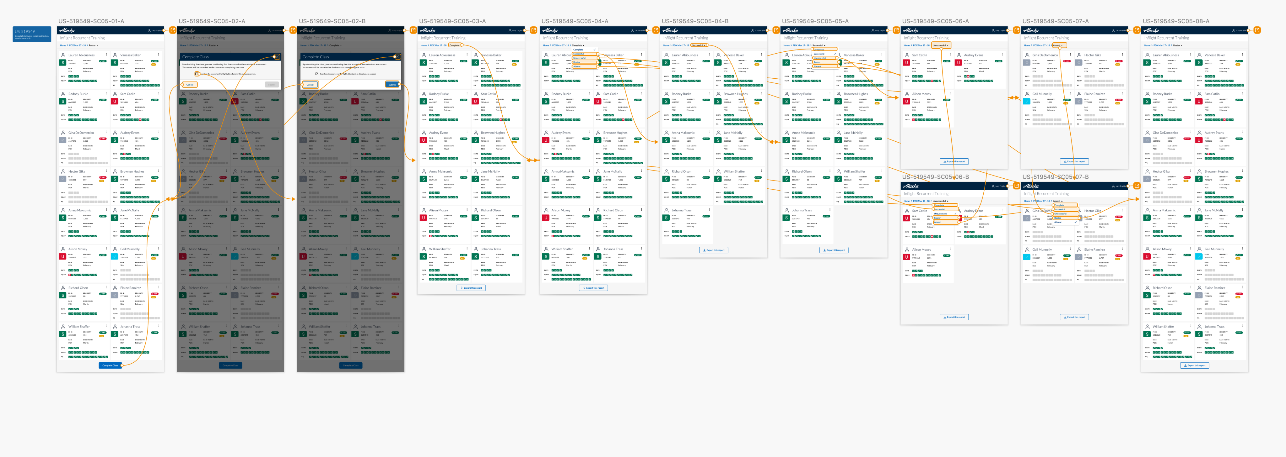
The final design was clean, intuitive, and dramatically simpler than the legacy process. Despite being limited to Alaska Airlines’ brand colors and typography, the interface felt modern and cohesive. The system guided instructors through each drill, ensured required steps were completed before moving on, and validated data before submission — eliminating the need for most peer auditing.
The screen that best represents the solution is the drill‑step view: a single, focused interface showing the trainee’s name, employee details, drill progress, pass/fail status, and any required retakes. Breadcrumbs allowed instructors to move effortlessly between the roster and individual drill screens.
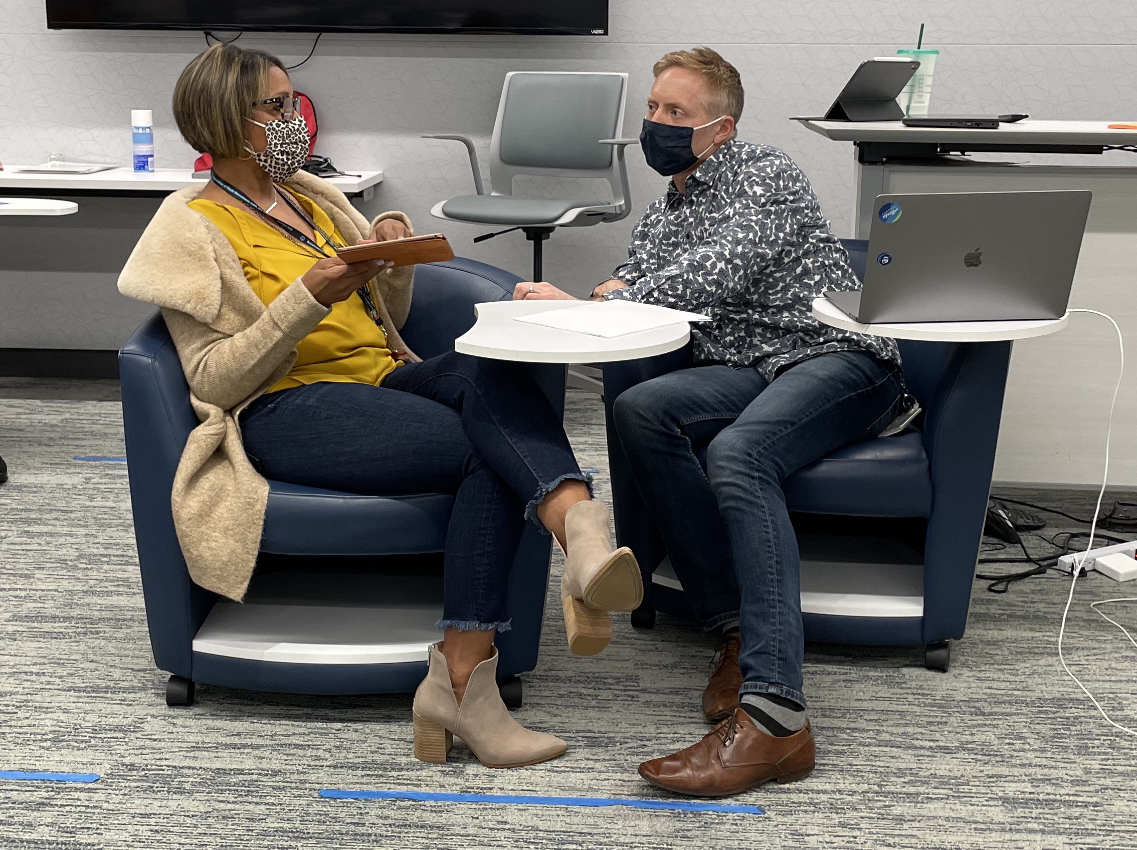
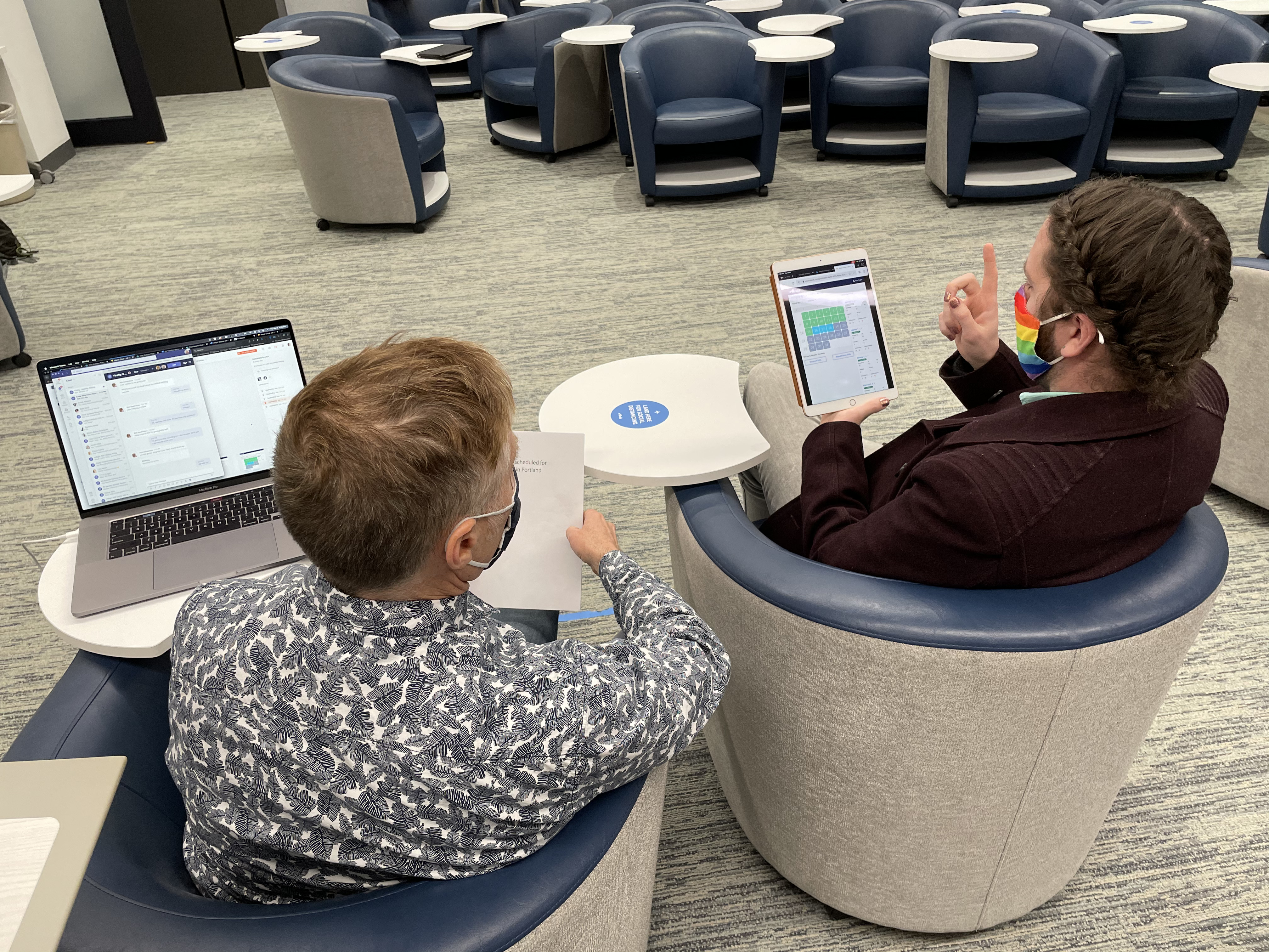
During usability testing with six flight attendants acting as drill instructors, the feedback was overwhelmingly positive. Without instruction, most participants navigated the interface correctly on the first try. They immediately appreciated how much time and stress the new system would save them.
The design eliminated shipping packets entirely and reduced the need for peer auditing. It also created a clear, real‑time view of class progress — something the paper system could never provide.
Impact
Because my contract ended shortly after usability testing, I wasn’t able to gather formal KPIs. However, the director of flight attendant training reported that the tool was successful and well‑received by instructors.
Based on the workflow improvements, I can confidently infer several outcomes:
Training results were processed instantly instead of being shipped and manually entered.
False negatives (incorrect fails) were significantly reduced.
The time required to complete a class was shortened.
The cognitive load on instructors was dramatically lower.
The risk of FAA compliance issues and union grievances was reduced.
Even without formal metrics, the qualitative impact was clear: instructors were eager to adopt the tool because it solved real, painful problems they had worked with since the program started.
Lessons learned
This project taught me the importance of deeply understanding regulated environments. FAA rules shaped the structure of the training, and the design needed to respect those constraints while still improving the experience.
I learned that non‑technical users thrive when interfaces are clean, simple, and aligned with their mental models. Every component must have a single, clear affordance. Every step must be obvious.
If I were to do this project today, I would start with a robust design system, use QA‑tested components, and avoid custom patterns unless research clearly justified them. I would conduct more rounds of usability testing, document edge cases more thoroughly, and gather quantitative KPIs to measure long‑term impact. I would also expand discovery with more job‑shadowing sessions to increase the statistical significance of the findings.
Most importantly, I learned that even in highly regulated, high‑stakes environments, thoughtful UX can dramatically reduce risk, improve accuracy, and make people’s jobs easier.