
 Enfineitz
A mobile-first tool for Alaska Airlines pilots to trade vacations — reducing errors, closing loopholes, and eliminating the need to read pages of documentation.
Project overview
Pilot Vacation Trading was a new feature added to an existing internal website used by Alaska Airlines pilots and airline operations as part of daily flight crew management.
Each year, Alaska Airlines pilots bid on their vacations, which are awarded by seniority. Following the bid season, a trading season opens, a window in which pilots can swap vacations they were not awarded. With over 4,000 pilots in the Alaska Airlines Pilots Union, this is a logistically complex process with significant stakes. Pilots are bound by union rules, and the airline is contractually obligated to manage the process fairly and accurately.
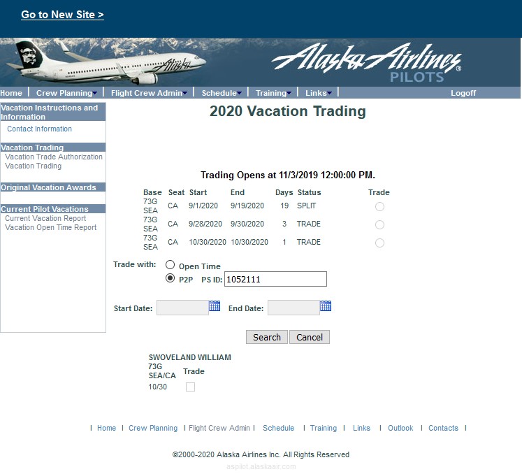
The legacy system had not kept pace with the needs of its users. It was a fixed-width, 800-pixel web application that appeared to have gone without a meaningful update since the late 1990s. It required pilots to manually enter redundant data, even their PeopleSoft employee ID, multiple times in a single session, even though Alaska Airlines already held all of that information in existing databases. The process was accompanied by pages of documentation pilots were expected to read before starting. It offered no mobile support, despite the reality that most pilots preferred to complete time-sensitive tasks on a smartphone.
Beyond usability, there was an integrity problem. Loopholes in the existing system allowed some pilots to exploit timing windows to acquire vacation time their seniority did not entitle them to. There was little oversight and no mechanism to catch or prevent it.
My role was Lead UX/UI Designer on a product team within the Crew Systems group. The team included a Product Manager, several full-stack developers, a QA engineer, and two senior pilots who served as representatives of the Alaska Airlines Pilots Union. I was responsible for research, personas, user flows, wireframes, visual design, developer handoff, and post-launch usability testing. The project spanned two product increments (approximately two fiscal quarters) tracked in Azure DevOps. I delivered additional pilot scheduling features in parallel.
I used Sketch for design and handoff throughout this project.
Exploration and discovery
I began discovery by working through the legacy vacation trading process myself, reading the full pilot documentation and attempting to complete trades as a first-time user. This established an early success metric: the new design should be intuitive enough that a pilot could complete their trades without ever opening the instructions.
I interviewed and shadowed approximately six pilots across multiple sessions — at the pilots' lounge at Seattle-Tacoma International Airport, at Alaska Airlines corporate headquarters, and in structured SME interviews with two senior pilots who were also union leaders. I conducted a survey about the existing process to surface and prioritize pain points, and collaborated closely with the Product Manager to map existing workflows.
The research surfaced a consistent set of problems. The legacy tool was fixed at 800 pixels with no responsive behavior, yet a majority of pilots told me they strongly preferred to complete time-sensitive tasks on a smartphone. Pilots had to manually enter their PeopleSoft ID and other identifying information — base, seat, equipment type, accrued and awarded days — multiple times per session, despite Alaska Airlines already holding all of it in existing databases. Errors and conflicts only surfaced at the end of the process, in long grey text blocks with no visual hierarchy or guidance. And my union-leader SMEs surfaced something I had not anticipated: some pilots were exploiting timing windows in the legacy system to acquire vacation time their seniority did not entitle them to, with no mechanism in place to catch or prevent it.
UX design process
The foremost design decision was to go mobile-first. This was not an expectation the product team brought to me — it was a recommendation I made based on my research and advocated for directly with the Product Manager and developers. Because pilots operate on strict, time-sensitive schedules and are rarely near a laptop when the trading window opens, designing for the smartphone first was not a preference — it was a necessity. I delivered full mobile designs with specifications showing developers how the interface would resolve at tablet and desktop breakpoints, with all touch targets and interactive elements sized for finger use.
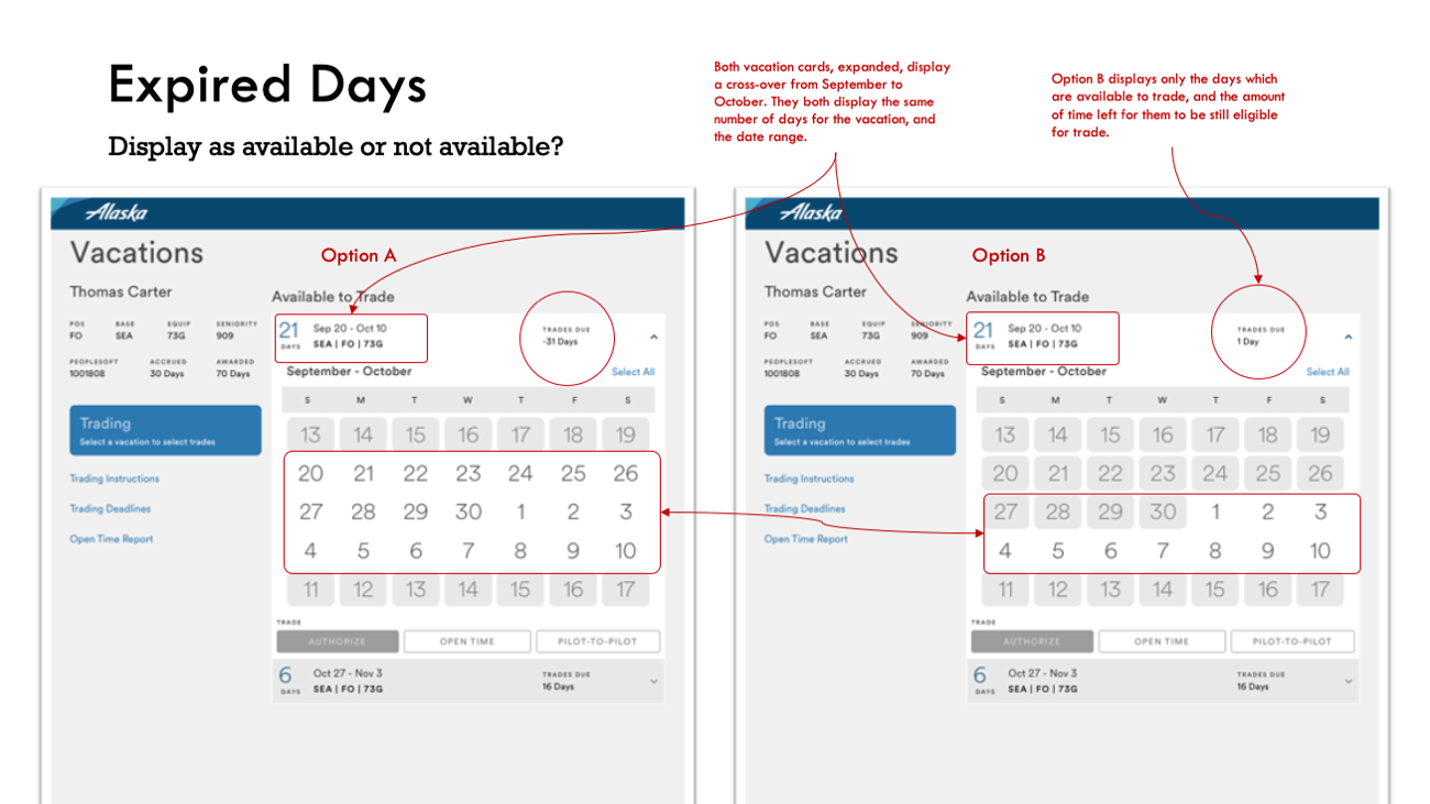
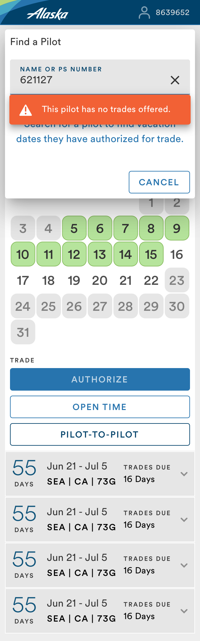
The most consequential design problem was closing the integrity loopholes. Because the new system authenticated pilots by their PeopleSoft ID once and automatically ingested their data — base, seat, seniority, accrued and awarded days — from existing Alaska Airlines APIs, it could cross-check entries against what it already knew. I broke the process into discrete, gated steps with progress indicators, locked states, and confirmation gates. A pilot could not proceed until the current step was valid. If an entry created a conflict or violated a rule, a prominently colored toast or alert message explained why — before they could move forward. This structure made it effectively impossible to exploit the timing windows that had allowed cheating in the legacy system.
The same step-gating and validation logic replaced the legacy approach of surfacing errors at the end of the process in long grey text blocks. Color and iconography replaced wordy status descriptions throughout, reducing the signal-to-noise ratio and making required actions immediately visible.
When developers struggled with front-end implementation, I built working solutions in CodePen using HTML, CSS, and JavaScript to demonstrate intent precisely. This was recognized as going beyond my role, and kept the team moving. I worked closely with the QA engineer in the second quarter to ensure designs held up under real conditions.
Final design
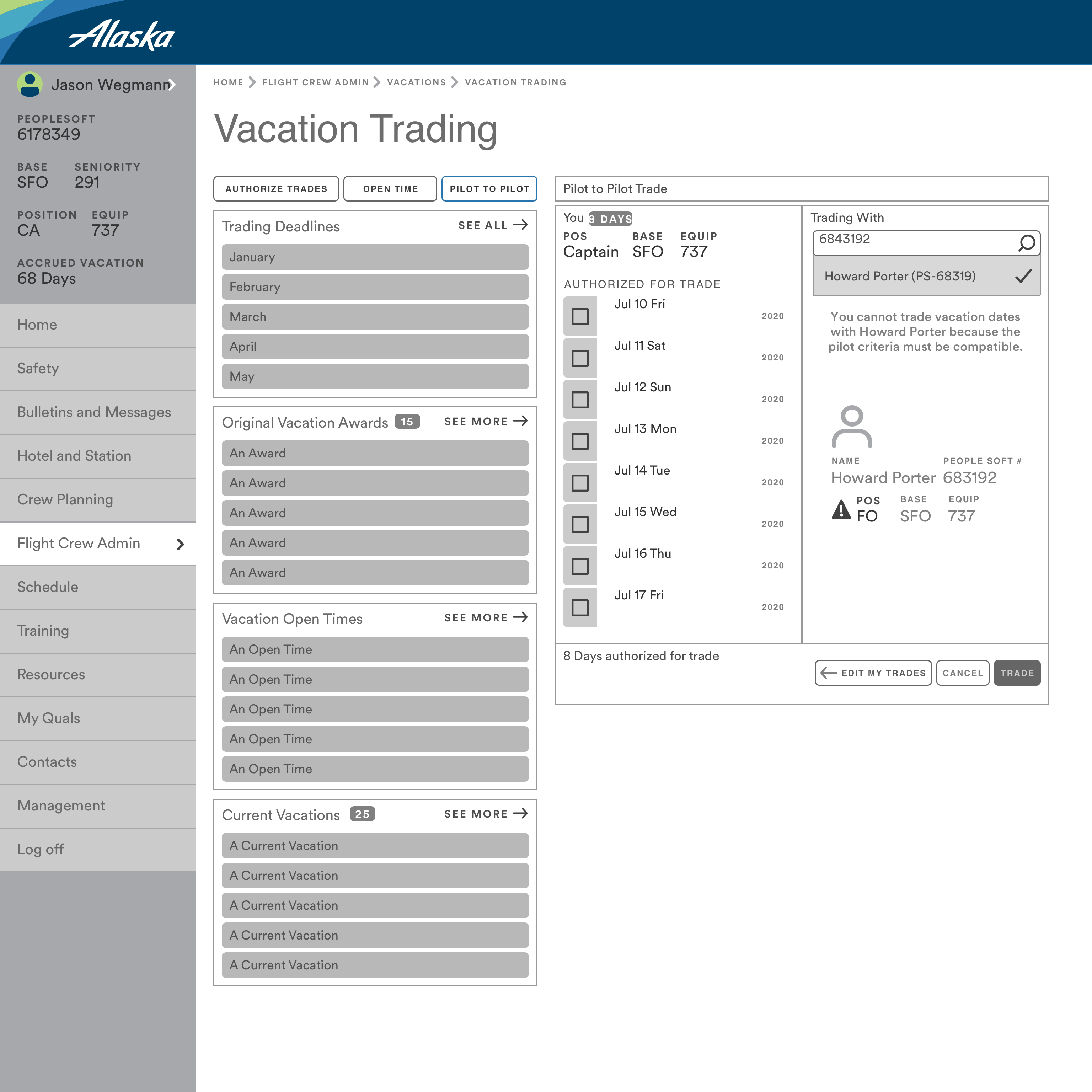
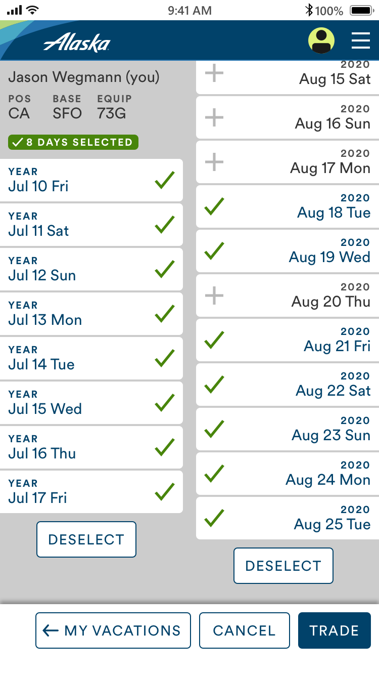
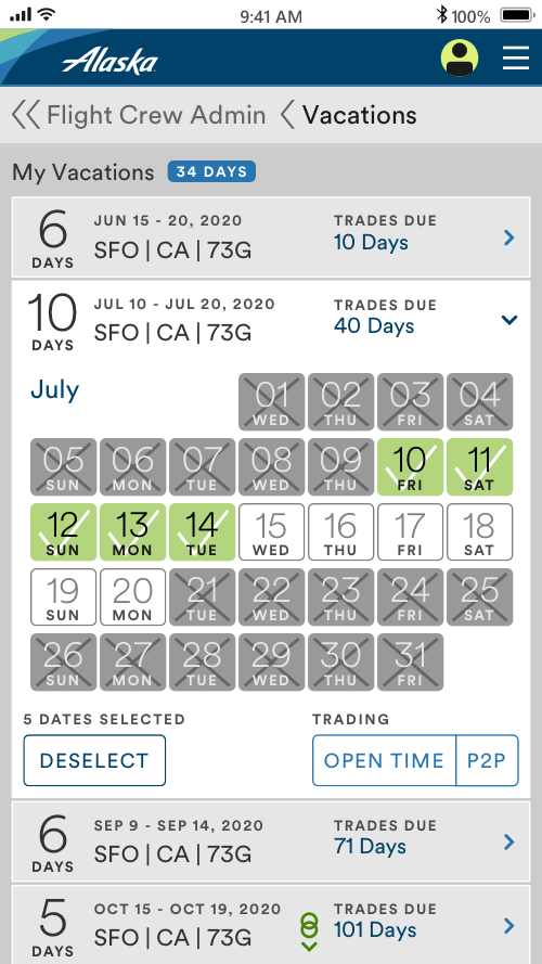
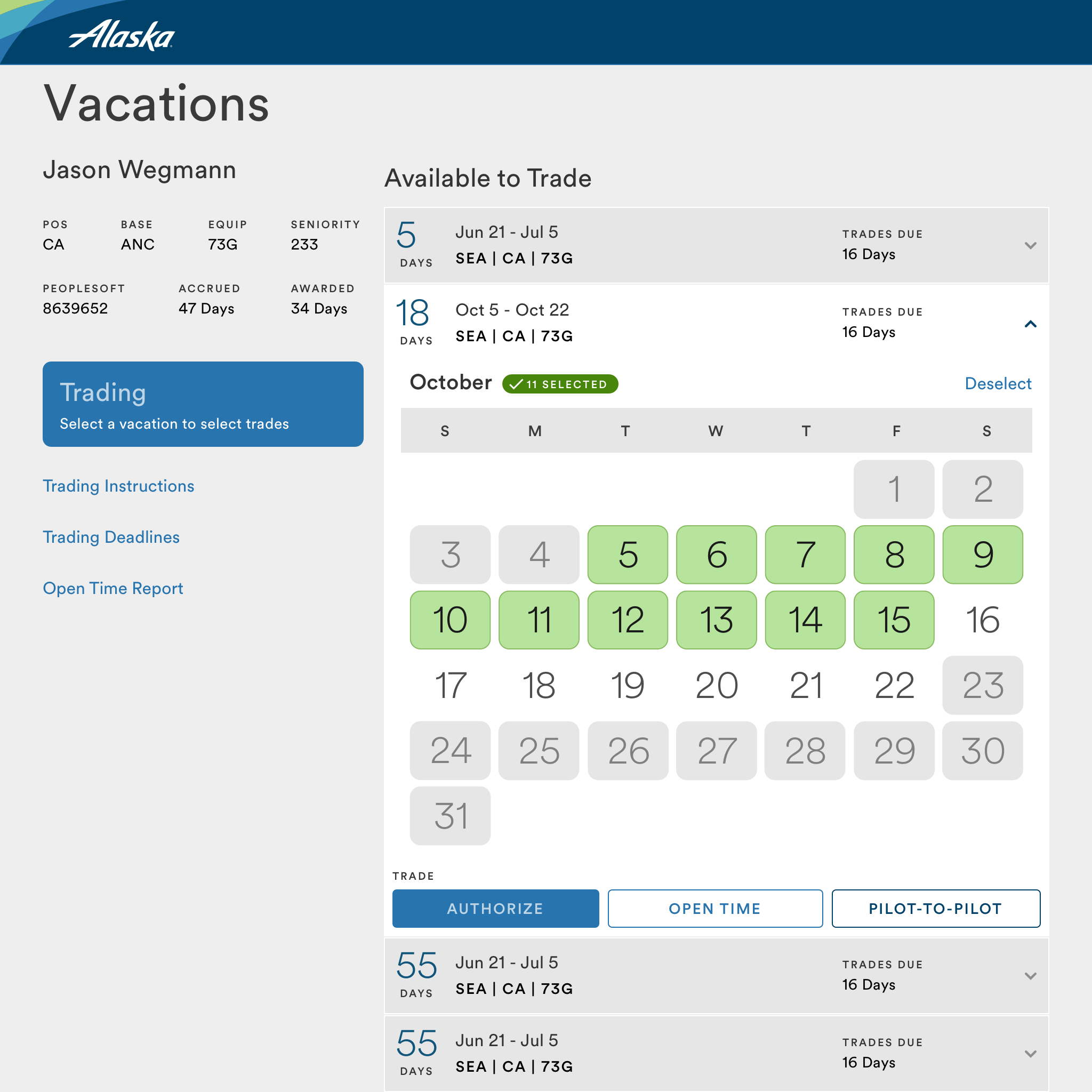
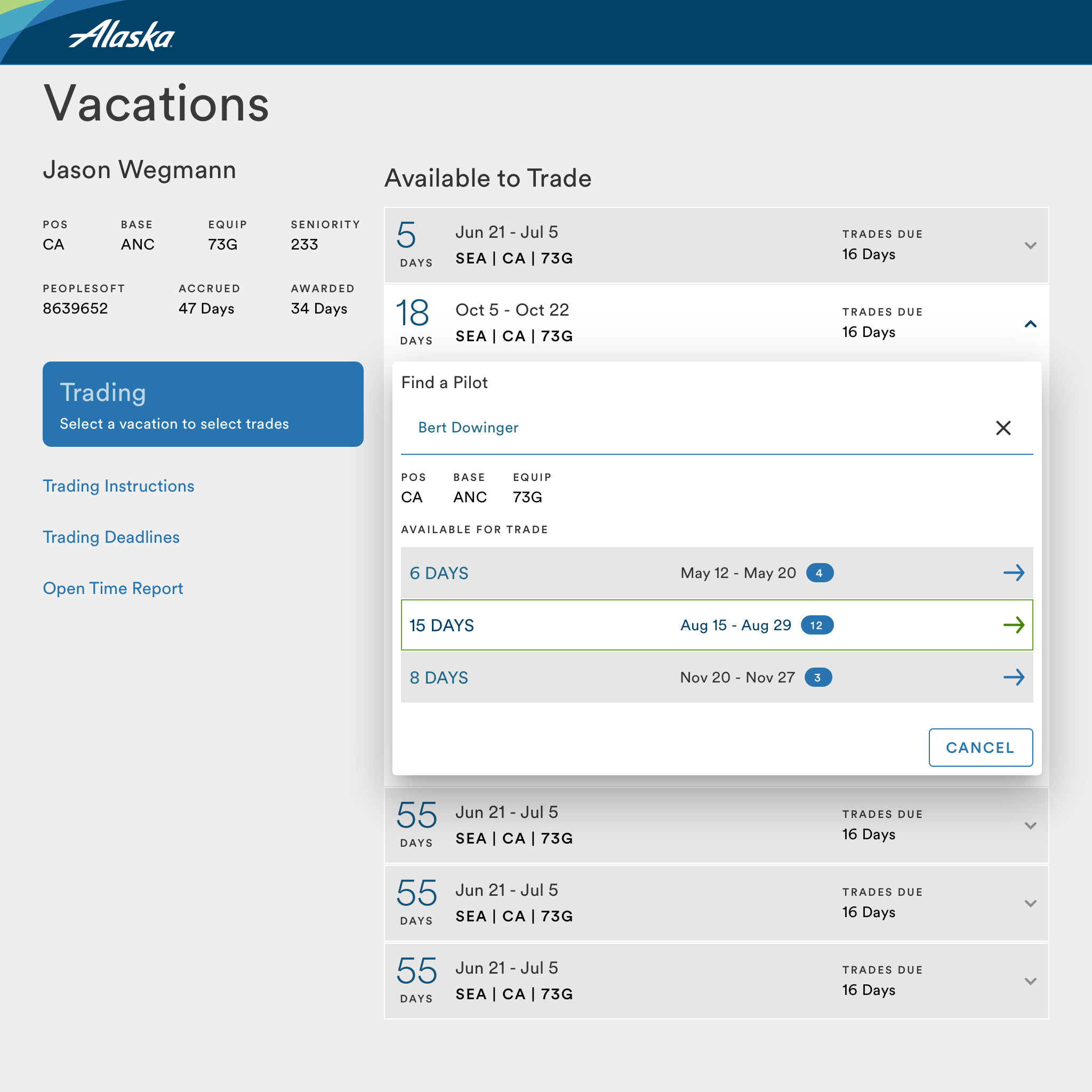
The final design brought together mobile-first layout, automatic data ingestion, step-by-step gating, and a color-forward visual system into a cohesive experience that felt markedly different from the legacy tool it replaced.
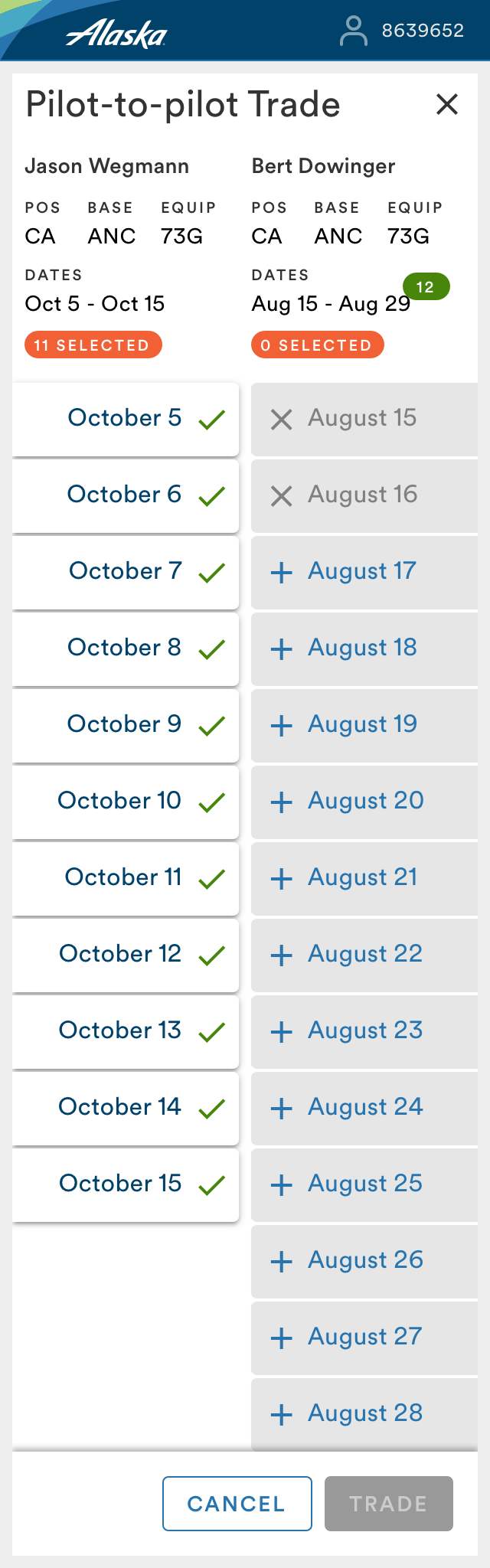
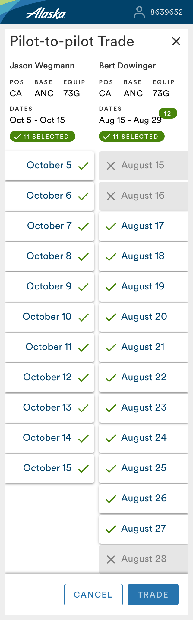
Where the legacy interface presented pilots with a dense, tabular layout at a fixed 800-pixel width, the new design was structured for a smartphone screen first — generous touch targets, clear typographic hierarchy, and a single focused task per screen.
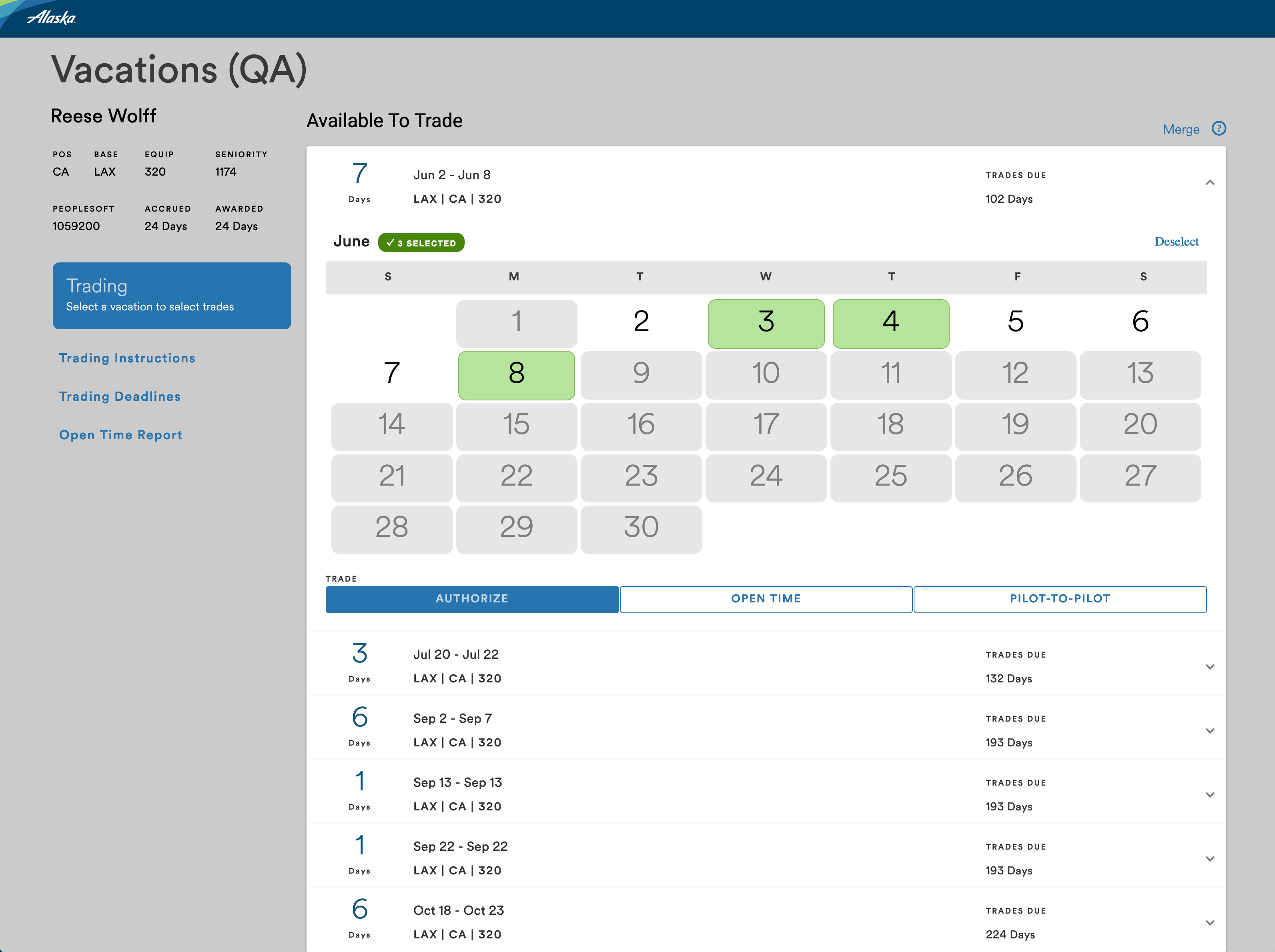
Color was used purposefully throughout. Status (available, pending, confirmed, blocked) was communicated through distinct colors rather than text labels alone. Alerts and validation messages used color to convey urgency and type. This introduced meaningful visual variety into what had previously been a neutral, monochromatic interface, and gave pilots immediate visual cues about what required their attention and in what order.
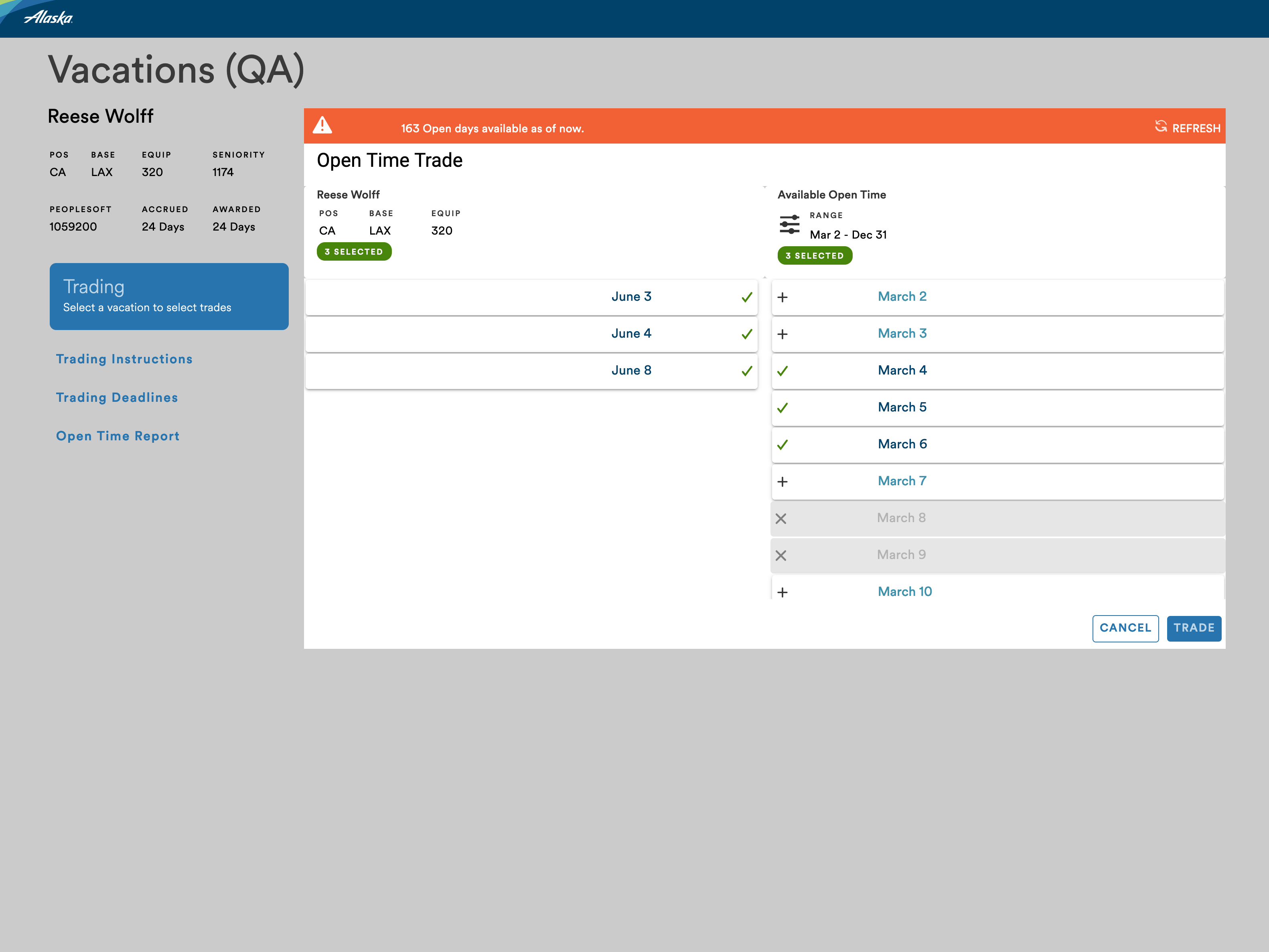
The step-based progress structure gave pilots a clear sense of where they were and what came next. Locked states and confirmation gates made the process feel structured and fair, which was important both for usability and for the integrity of the trading system.
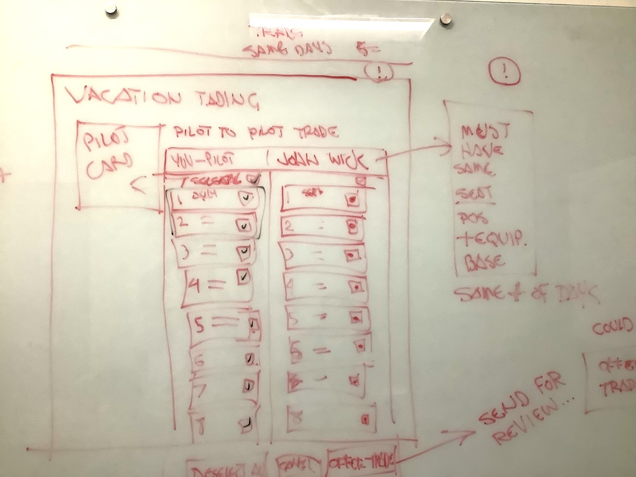
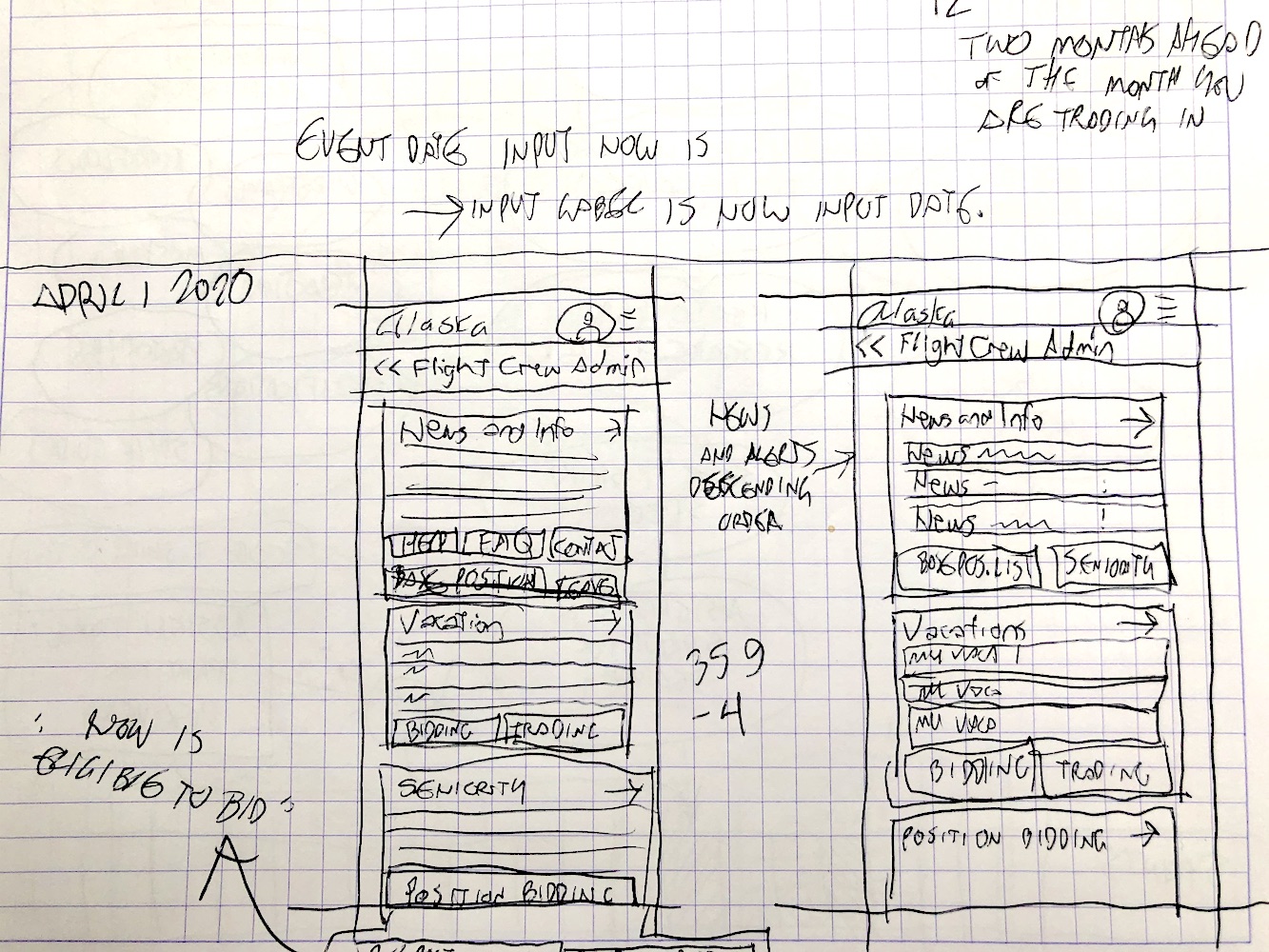
I delivered polished, annotated mockups to the engineering team covering mobile, tablet, and desktop breakpoints, along with specifications for all interactive states, validation behaviors, and transition logic. I retained approximately 20 mobile-optimized design screens from this project, along with user flow artifacts from my whiteboard and graph-paper research sessions with pilots and SMEs.
I also designed a companion administrative tool for the scheduling team — built desktop-first, reflecting the different working context of schedulers, who perform this work at a fixed workstation.
Impact
The Pilot Vacation Trading feature shipped in time for the 2020 vacation trading season. All 4,000-plus members of the Alaska Airlines Pilots Union were required to use it.
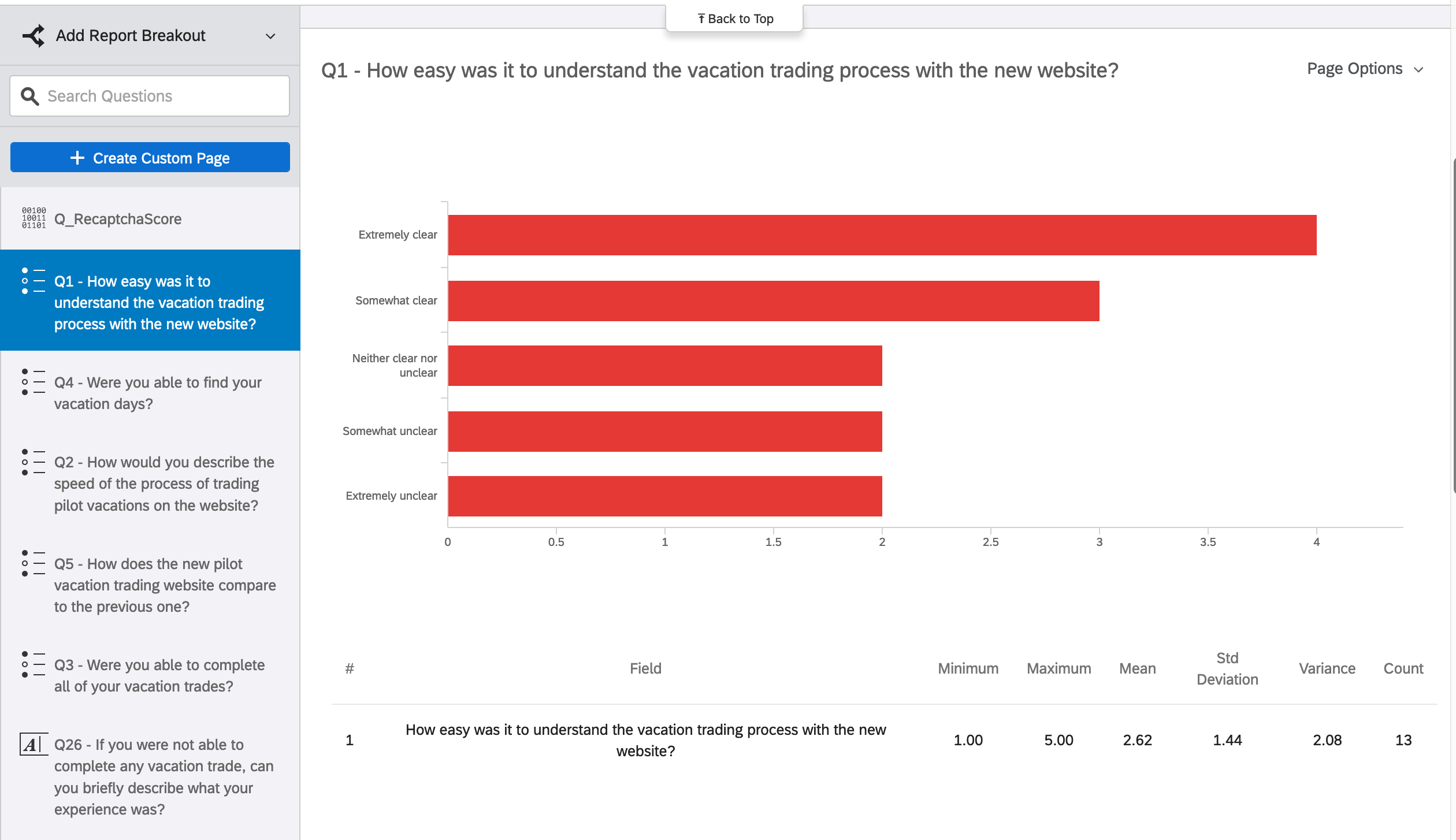
A post-launch survey was conducted to gather pilot feedback. Of 13 respondents to the question "How easy was it to understand the vacation trading process with the new website?", 7 rated the experience as extremely clear or somewhat clear. Some negative responses in the survey were directly attributable to a system-wide technical outage at the start of the trading season that made certain features unavailable: pilots used the survey to express frustration with the outage, which was unrelated to the design.
Usability testing conducted with the beta site immediately before the trading season surfaced actionable insights for future iterations.
Qualitative feedback from pilots was notably positive. One of my SME pilots — a senior union leader who had worked with me from the beginning of the project — described the design to a senior business leader as "ridiculously user friendly." Other pilots described it as a beautiful design.
The analytics dashboard set up for the feature tracked device type, location, pilot position, and usage patterns, and affirmed many of the qualitative findings from research, including the mobile-first assumption.
The design achieved the goal established in discovery: pilots could complete their vacation trades without consulting the documentation. The process took fewer steps, required less manual data entry, and prevented the kinds of errors and integrity violations that had characterized the legacy system.
Lessons learned
This project reinforced that research-driven design decisions, even those requiring advocacy, produce better outcomes. The mobile-first direction was not assumed by the team; it came from the research. Making that case early, and holding to it, shaped every subsequent design decision.
The integrity loophole problem was one I did not anticipate going into discovery. It surfaced through trust: my SMEs were candid about a painful and somewhat uncomfortable reality. That kind of candor only comes when research relationships are built carefully. The solution required me to think about the design not just as a user interface, but as a system with rules that needed to be enforced through the UI itself.
The front-end skill gap on the team was a persistent challenge. Building CodePen prototypes to communicate complex interactions was effective, but it also revealed a gap in my handoff process. More precise, annotated specifications earlier in the process would have reduced the back-and-forth. This project pushed me toward more rigorous documentation, which I carried into subsequent work.
I also learned that pilots, as a user group, respond strongly to visual design. They were genuinely engaged by good UX. That was a reminder that even in utilitarian, business-critical tools, aesthetic quality matters and is noticed.
Finally, the post-launch survey and usability testing made clear that one iteration is never enough. The features that were descoped from the first release, and the insights gathered from testing, gave the team a well-defined roadmap for the next update.