
 Enfineitz
Rethinking How Military Maintenance Data Is Understood
Transforming a confusing, underutilized defense tool into an intuitive, visual experience for maintenance planners.
Project overview
The first time I opened the NGPS aircraft detail view, I could tell something was off. The entire feature lived inside a modal that covered almost the full screen, yet it still managed to hide the information that mattered. The timeline browser was the most confusing part. It allowed users to scroll endlessly into the past or the future. During testing, I joked with participants that they could scroll back to the Revolutionary War. The joke landed because it was true. You could drag the timeline all the way to 1776, then spend several minutes scrolling forward again just to find real data.
Leadership already knew the feature was underused. Product analytics showed that users rarely reached the aircraft detail page. My own usability testing confirmed the problem. Almost every tester failed to reach the detail view without help. The tool was meant to help maintenance planners understand the full history of an aircraft, platform, or fleet. Instead, users exported spreadsheets and completed their work in Excel.
I joined the project as the UX designer. I worked with a Lead UX designer, two product owners, several subject matter experts, and a small engineering team. Because this was a defense product, I could not speak to real Navy or Marine Corps maintainers. I had access to only three SMEs, all former military, and I had to design within strict security constraints.
The moment I realized this was not a simple UI cleanup came during usability testing. Testers could not find anything. They clicked on elements that looked interactive but were not. They ignored elements that were interactive because they did not look like they were. The timeline was the worst offender. Users became disoriented and frustrated. The interface was not only confusing. It was actively preventing people from doing their jobs.
Exploration and discovery
I began by mapping the workflows and service blueprints for how maintenance planners were supposed to use NGPS. I validated these maps with my primary SME, a former Navy maintainer with deep institutional knowledge. His feedback helped me refine the journey into something closer to the optimal workflow, not just the intended one.
The most surprising insight came from watching how SMEs actually used the tool. One SME had taught himself to script queries because the UI was too slow and confusing. Another SME downloaded the data into Excel and completed the task there, even though the feature technically supported everything he needed. These were not power user tricks. They were survival strategies.
The emotional pain points were clear. Users felt cognitive overload. They did not trust the tool. They were confused about what was clickable. They felt the interface was working against them.
The biggest gap between the intended workflow and the actual workflow was simply finding the information. Users could not reach the detail page. Once they did, they could not interpret the timeline. And once they found a record, they had to scroll horizontally and vertically to read all twenty seven data points.
I validated these findings through usability testing. I asked testers to find specific maintenance information. Most could not complete the task without leading questions. The timeline was the most confusing part. Testers became lost, disoriented, and frustrated.
At that point, I knew the redesign needed to do more than clean up UI. It needed to rebuild the mental model of how maintenance history is explored.
UX design process
The timeline was the heart of the problem and the heart of the solution.
Designing the timeline altitude system
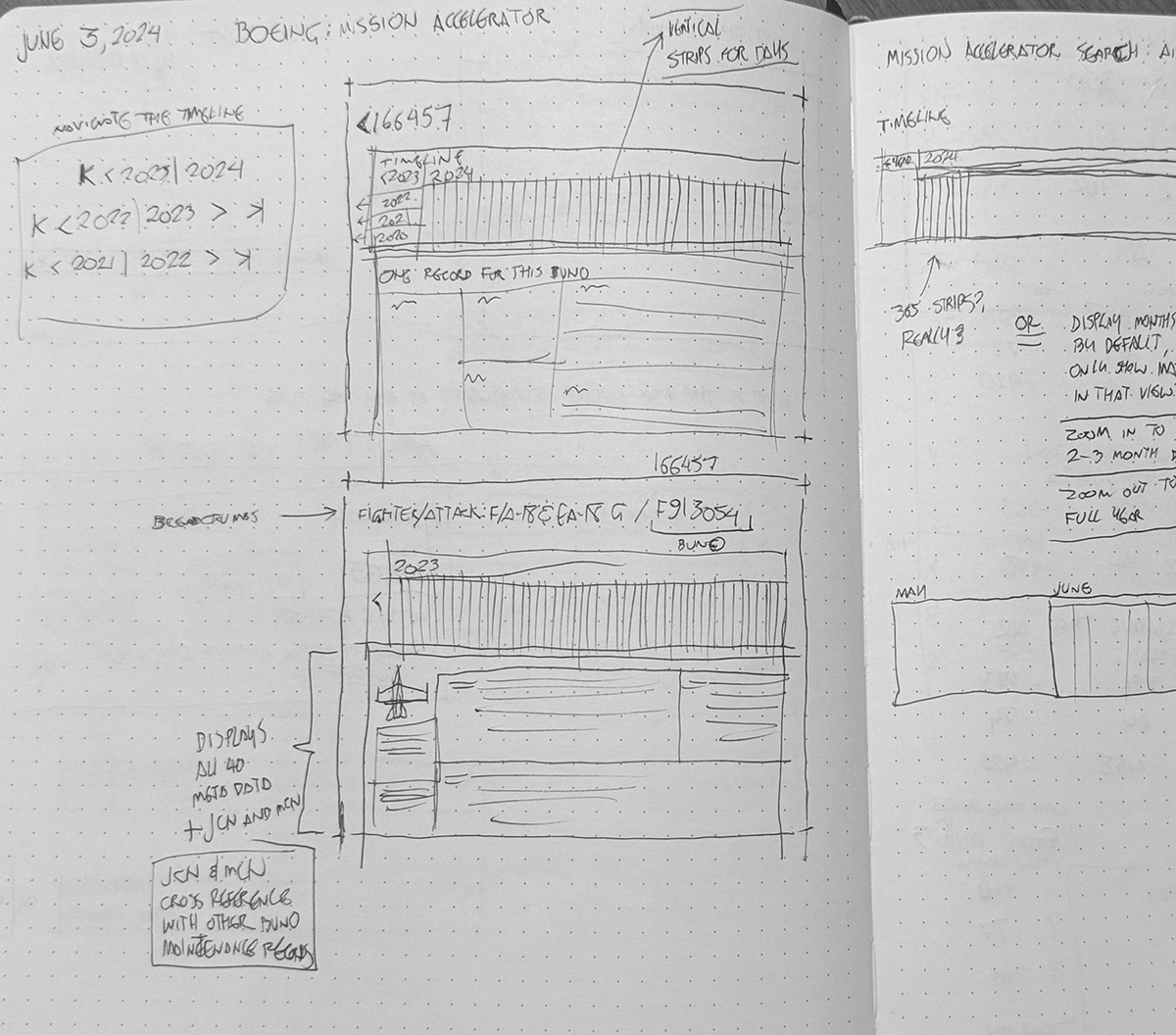
The original timeline allowed infinite scrolling. Users drifted centuries into the past or future. It was visually overwhelming and cognitively disorienting.
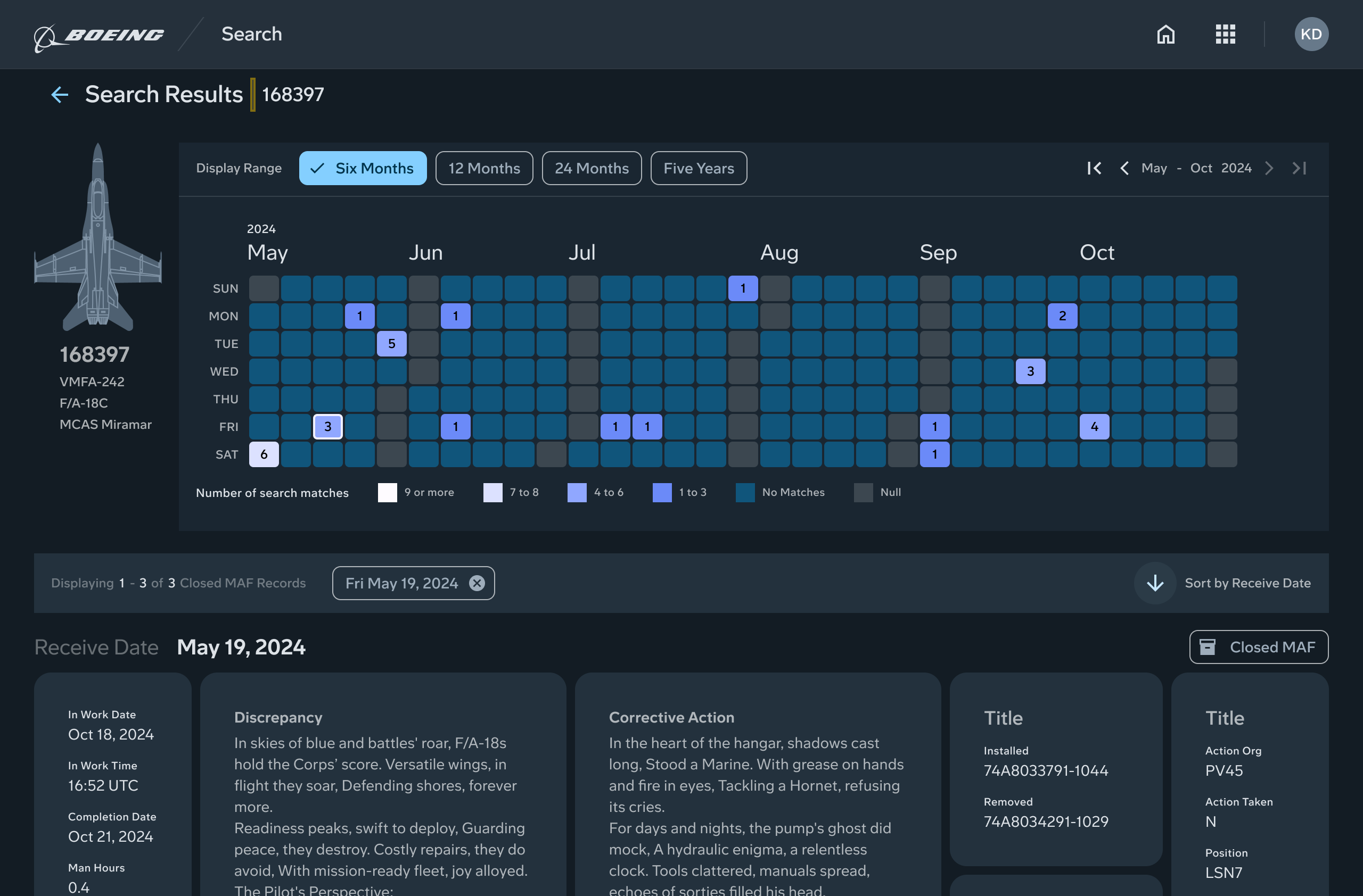
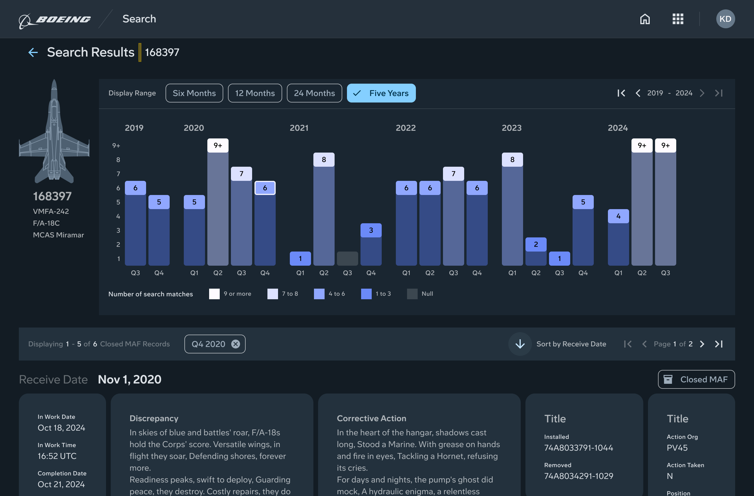
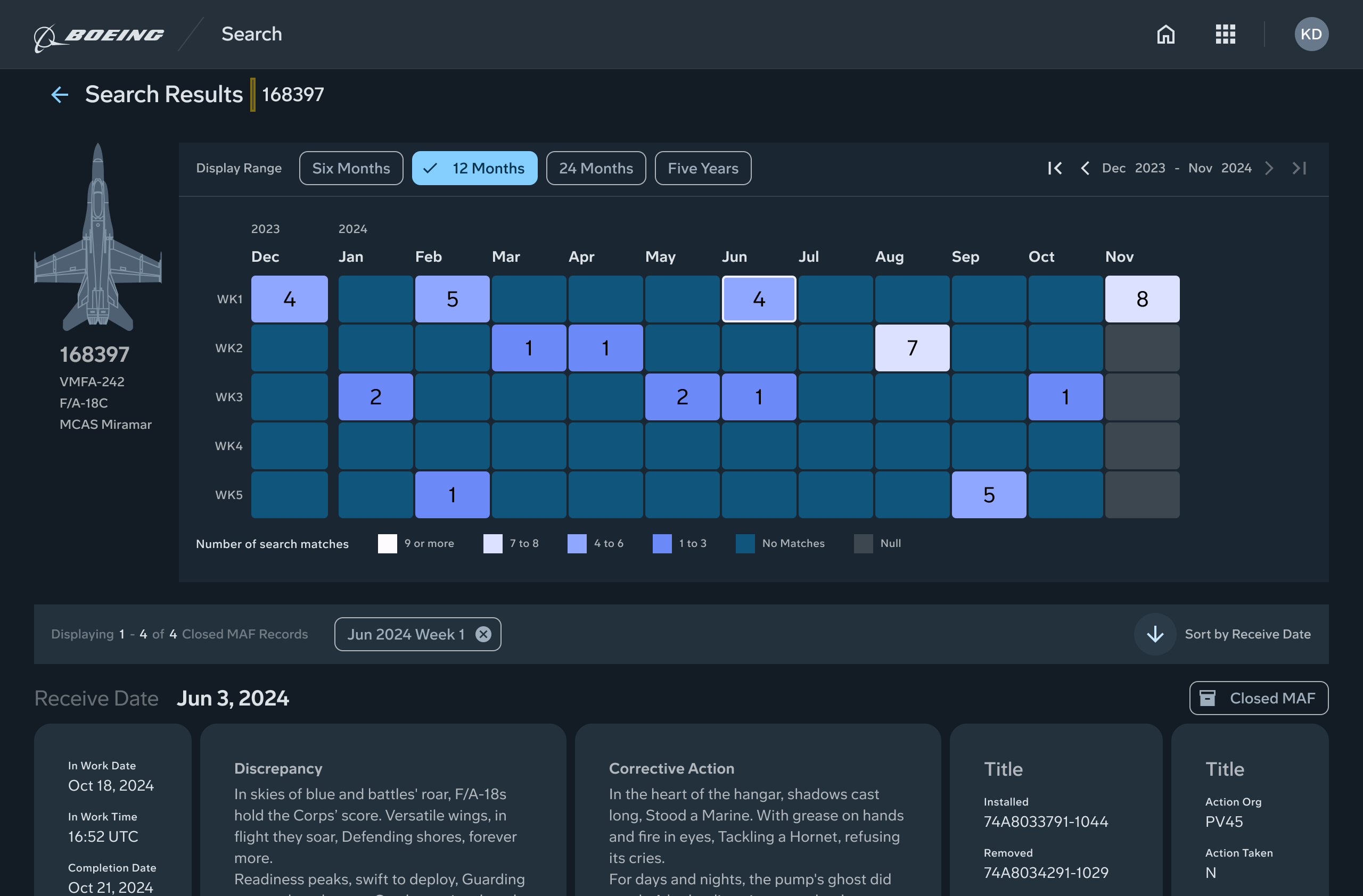
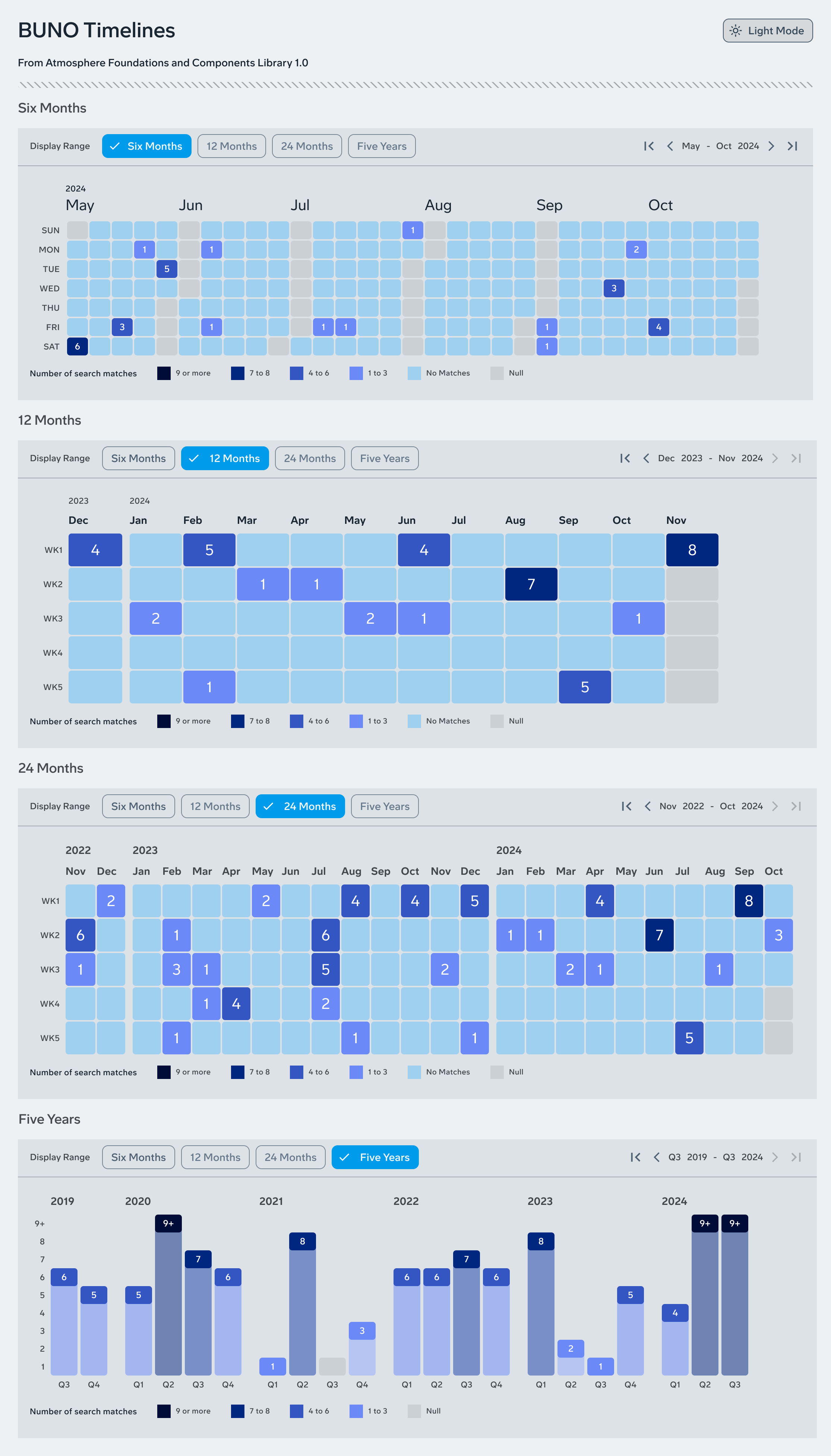
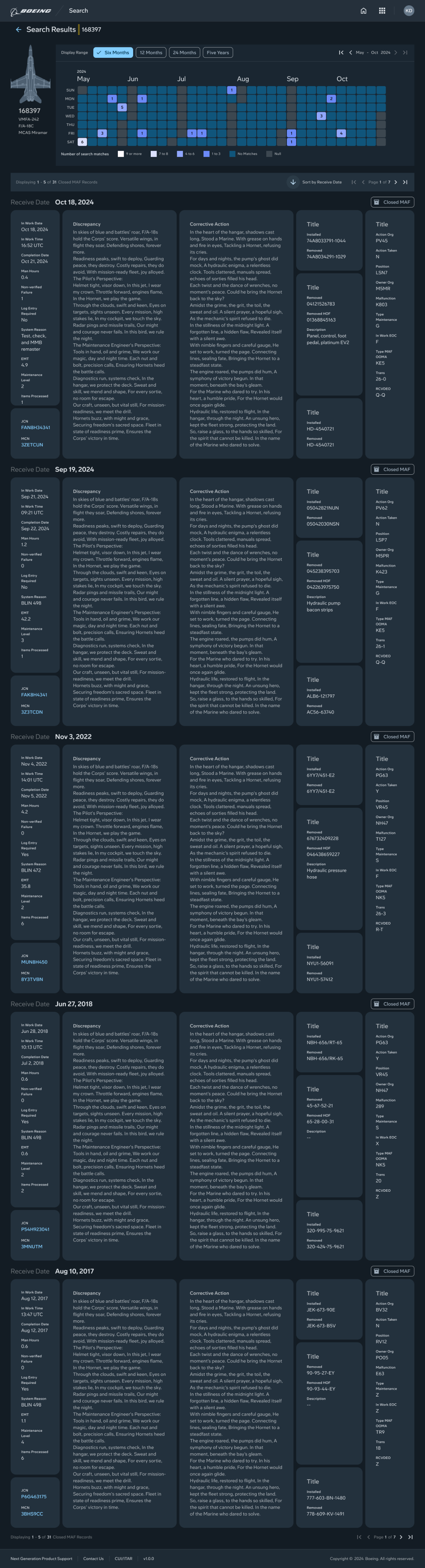
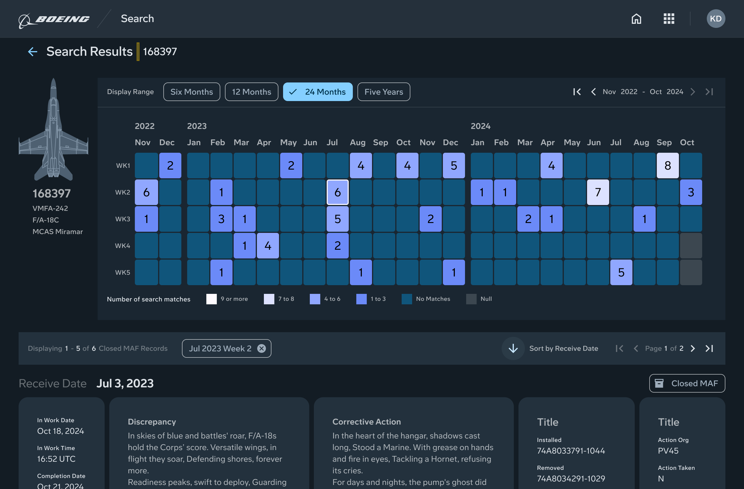
I designed a new system based on timeline altitude. It offered four preset scales that matched real maintenance needs. Six months, twelve months, twenty four months, and five years. These scales came directly from SME feedback. No one needed to see the entire lifespan of an aircraft. They needed to see patterns, clusters, and frequency.
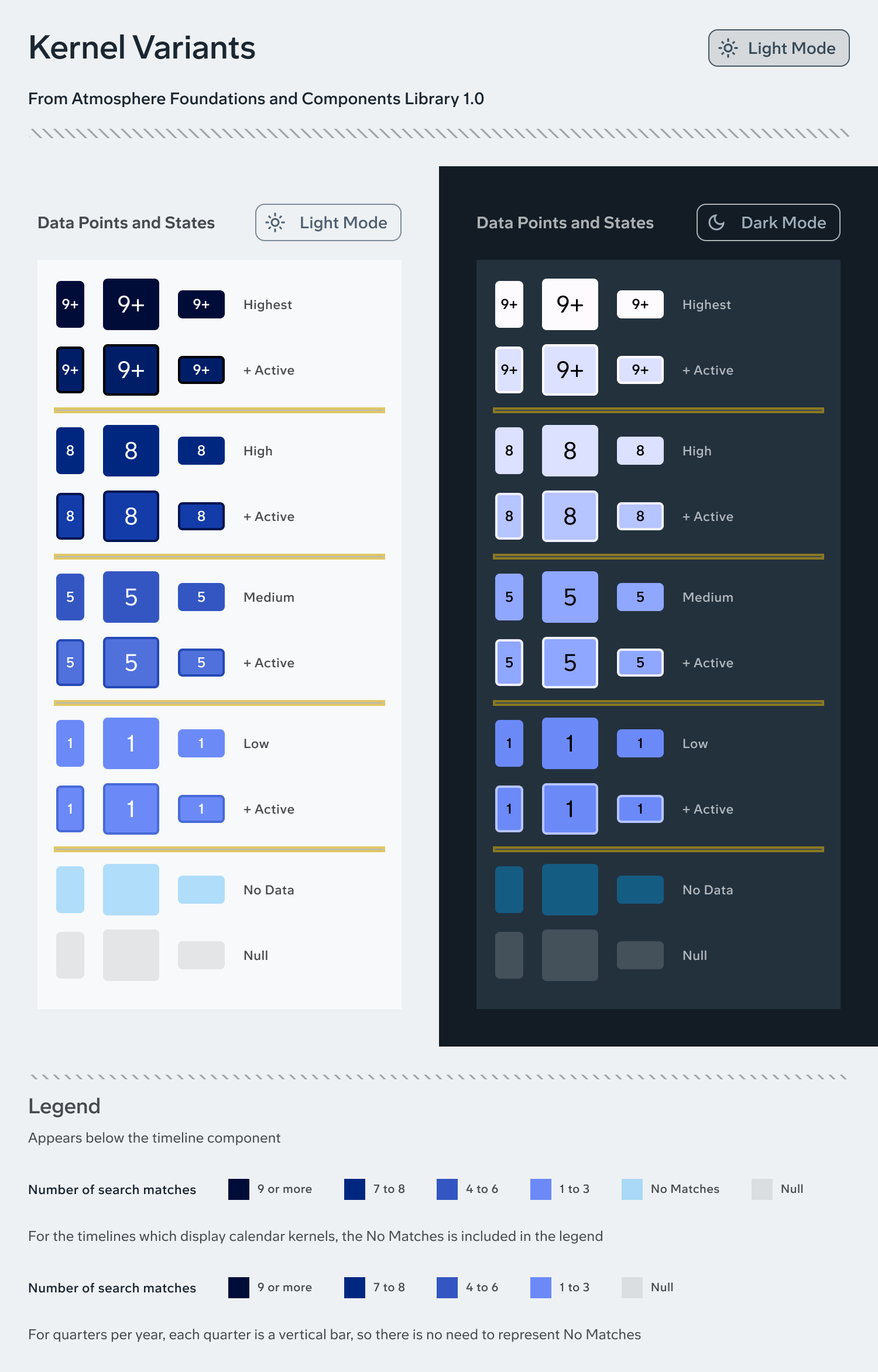
I prototyped the color legend using Atmosphere DLS tokens so the visualization harmonized with the design system. The new timeline was simple, predictable, and impossible to get lost in.
Reinventing the maintenance record layout
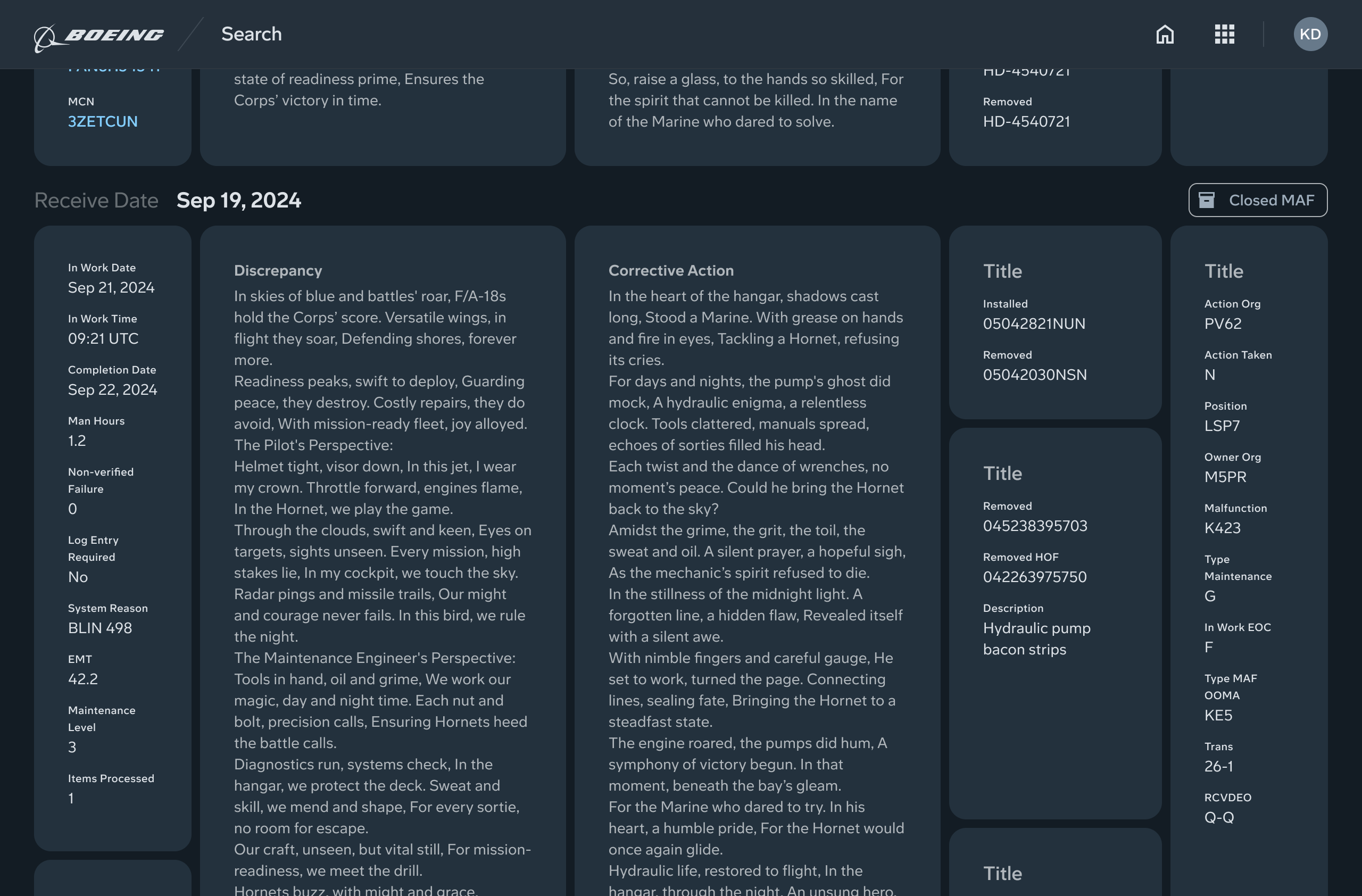
Each maintenance event had twenty seven data points. The legacy design displayed them in a twenty seven column table, which meant users had to scroll horizontally and vertically to read anything.
I ran a ranking exercise with SMEs and testers. I asked them to identify the top seven data points they needed most. This gave me a clear information hierarchy.
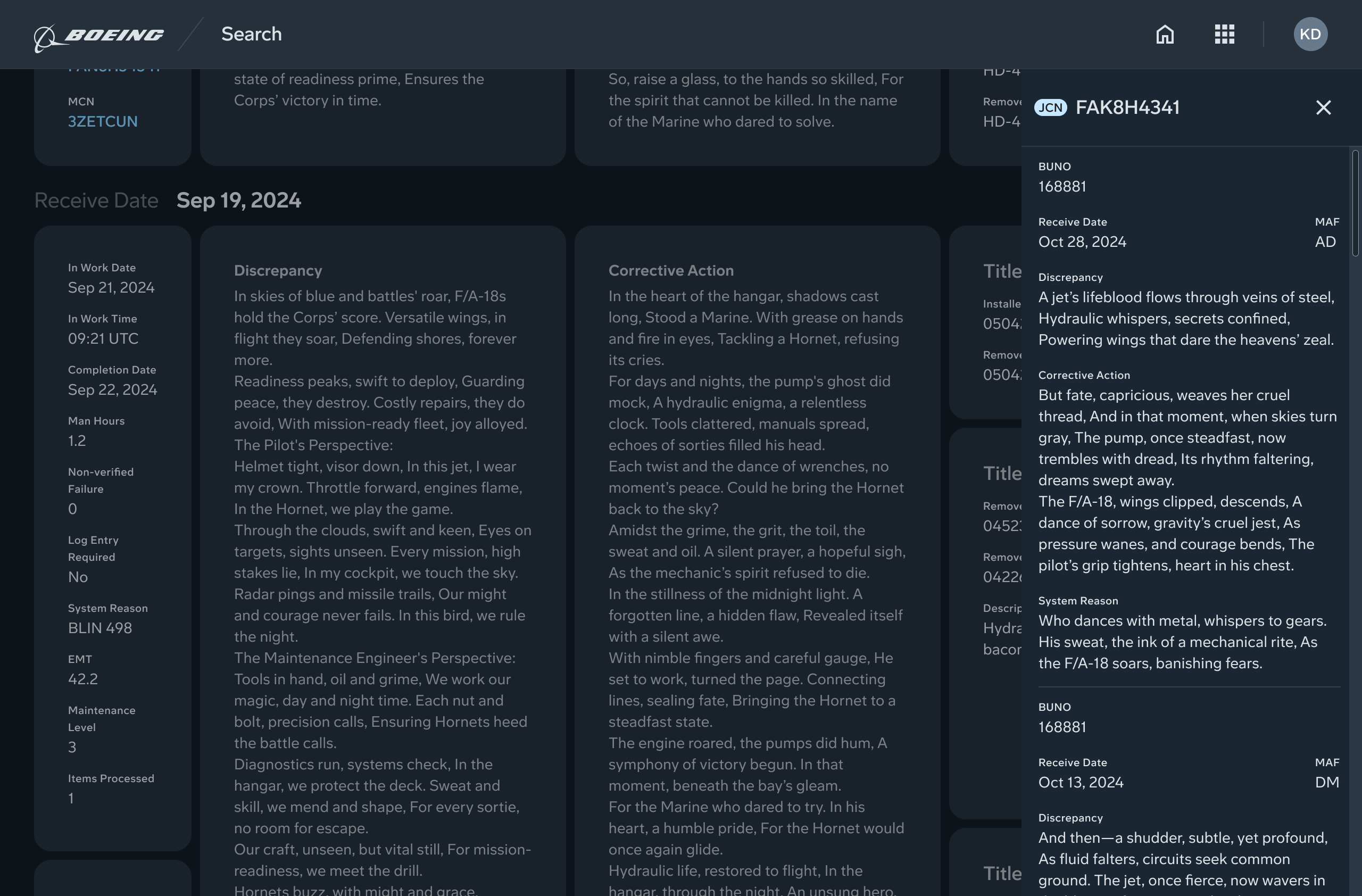
I designed a masonry grid for each maintenance event. It was a card based layout that surfaced the most important data first, while still showing all twenty seven fields without scrolling. It was dense but readable. Structured but flexible.
The aircraft diagram that should have been
One of my favorite concepts was a heatmapped aircraft diagram. I sketched it in FigJam and showed it to SMEs and PMs.
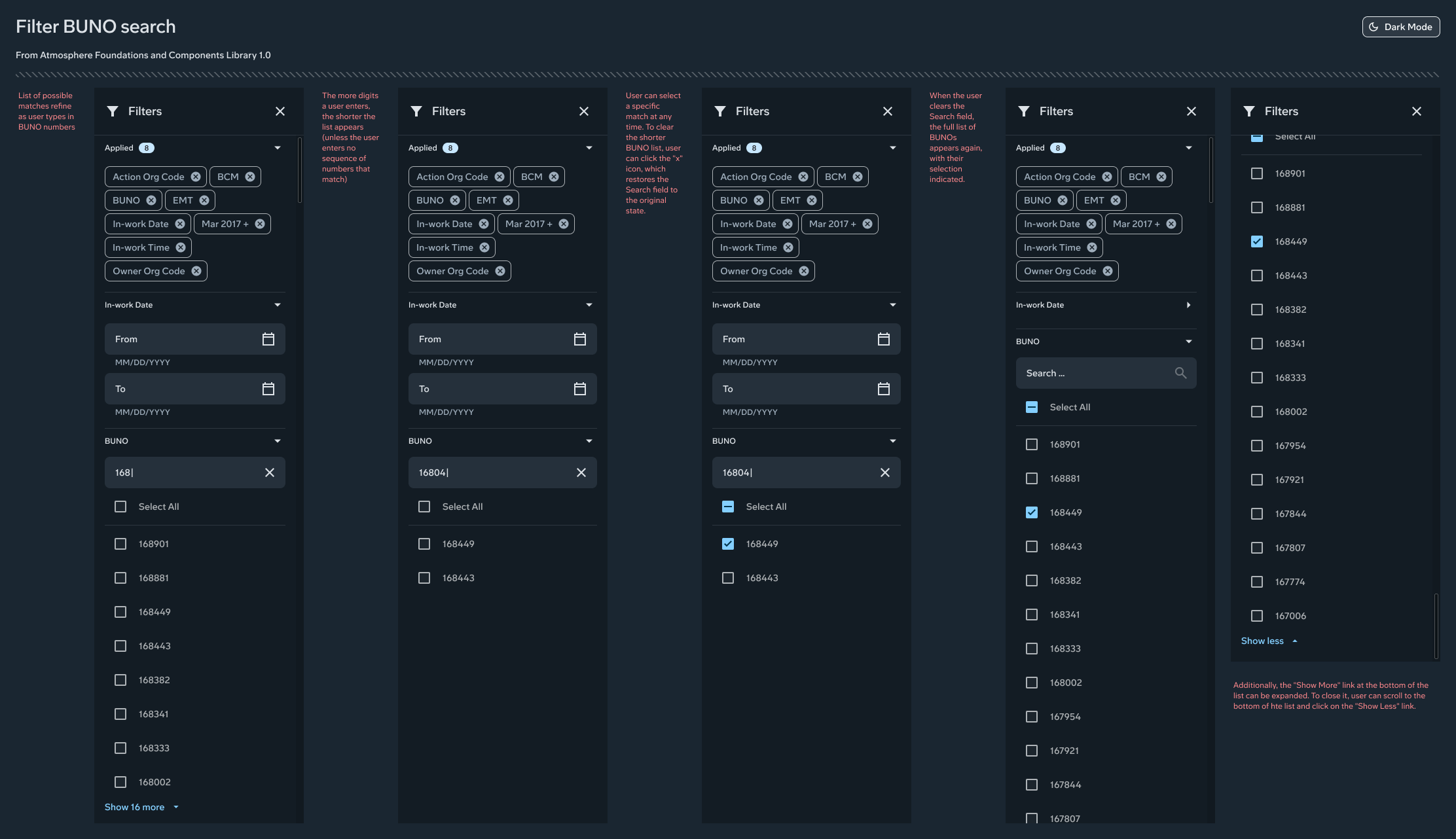
The idea was simple. Hotspots would light up based on the user’s search query. As filters were applied, the hotspots would tighten. Clicking a hotspot would filter the results instantly. It was inspired by video game UX. It behaved like a minimap for maintenance data.
Everyone loved it. It was considered out of scope for the release.
Building within a design system
I built the masonry grid using Atmosphere DLS cards, typography, spacing, and color tokens. The timeline had to be built from scratch because no atomic components existed for it. I still used DLS tokens to ensure consistency.
I validated everything through design critiques and SME reviews. Then I handed it off to engineering. I was reassigned very soon after that.
Final design
The final design was clean, visual, and intuitive. It replaced confusion with clarity and replaced scrolling with structure.
The timeline view and the aircraft profile diagram were the hero moments. Together they communicated thousands of words of information in a single glance.
The timeline showed patterns, frequency, and density. The aircraft diagram grounded the user in context. The masonry grid made dense data readable.
SMEs immediately understood the improvements. They could see the maintenance history at a glance. They could navigate time without getting lost. They could find records without exporting to Excel.
If someone saw only one screen, it would be the aircraft detail page. The timeline, the diagram, and the masonry grid worked together to create a coherent experience.
Impact
Because I was reassigned immediately after handoff, I could not conduct follow up research. Based on SME feedback and usability testing, I believe the redesign improved task completion by at least ninety percent.
The redesign enabled faster identification of maintenance events. It reduced scrolling. It made patterns easier to interpret. It lowered cognitive load. It increased trust in the tool. It reduced reliance on Excel.
Most importantly, users could finally reach the detail page. In the legacy design, almost every tester failed to reach it.
Lessons learned
This project taught me how to design inside a security constrained environment. I learned how to distinguish between data that must remain behind clearance and data that is safe for civilian use. I learned how to design for users who rely heavily on acronyms, precision, and speed.
I also learned how powerful visual communication can be. The timeline and aircraft diagram were not just UI elements. They were cognitive tools.
If I could redo the project today, I would push harder for the aircraft diagram with hotspots. It would transform the experience. I would also document the new patterns I created so other Boeing teams could reuse them.
Finally, this project taught me how to build complex organisms from atomic design components. It also taught me how to prototype responsive behavior at the component level before testing.